Overview
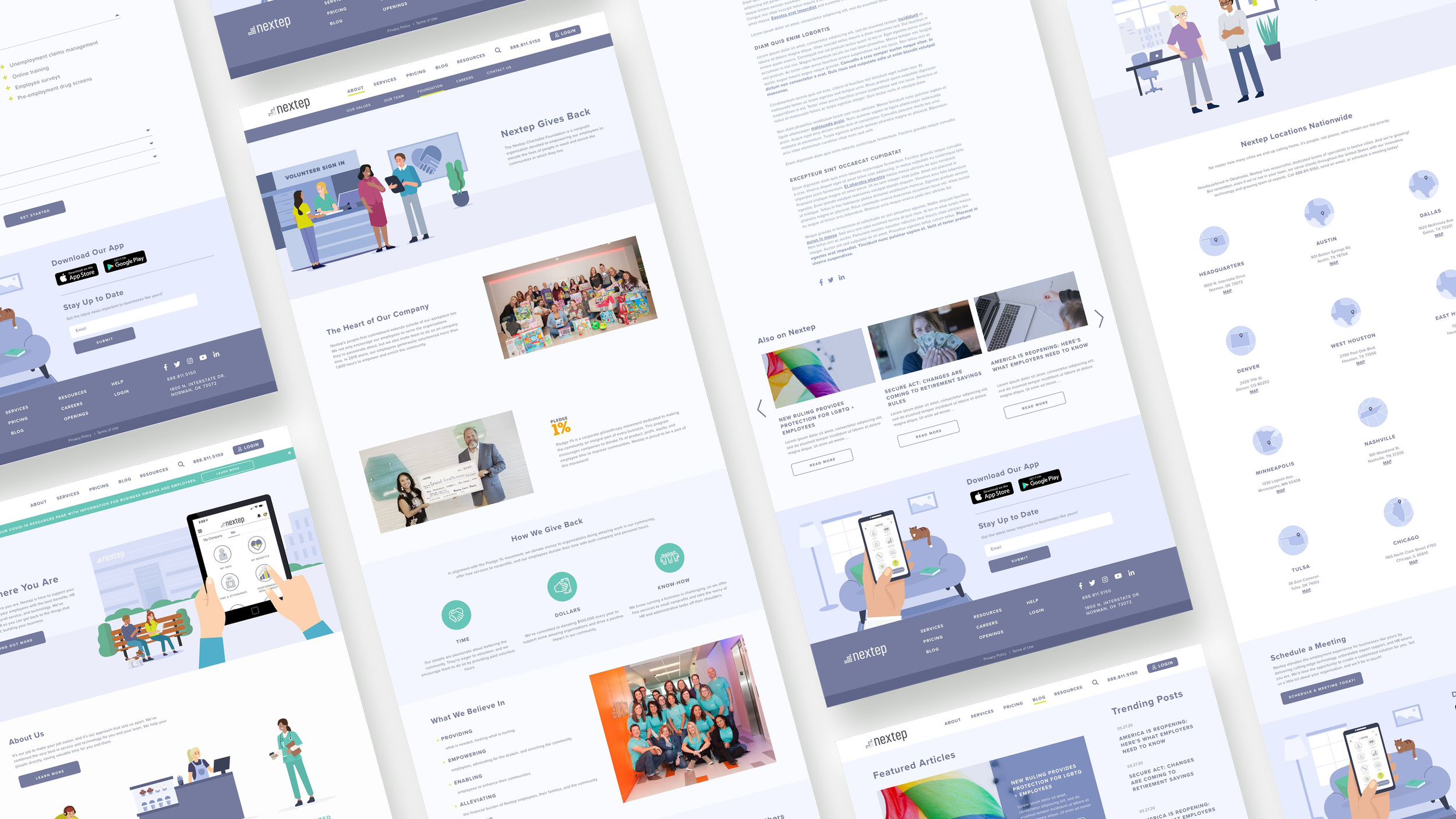
I lead a team in redesigning an HR company’s website Nextep. I had previously lead a rebranding for the company, and the client loved it so much they wanted to implement that on their website.
Part of the process was re-mapping their site map, fixing some UX on their previous site, and rebranding the whole site in the new design.
-
The current Nextep website was outdated in terms of imagery and user experience. A lot of the website pages didn’t connect to other parts of the website or live in a space that made sense.
-
UX Design Lead & Art Director
-
1 Graphic Designer
1 Project Manager
1 Web Developer
01 Sitemap
Original Sitemap
The first step was to fix the website UX as the UX of the site made it difficult for users to get to the pages they needed to go. A lot of pages weren’t linked & many were in confusing spots.
Pricing was hidden at the bottom of Services page, and the Blog page was also hidden under Resources. News was also separated from the Blog page.
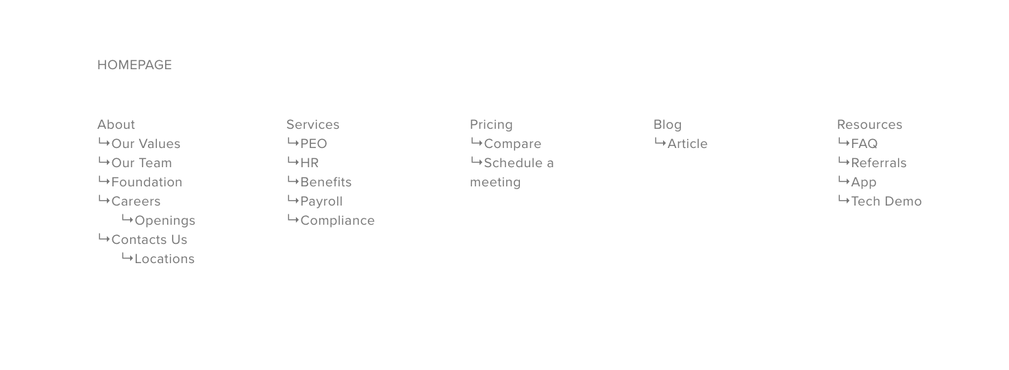
Updated Sitemap
This new site map broke each section into sections with repeating information that could easily be linked, which made the usability significantly increase.
02 UX Design


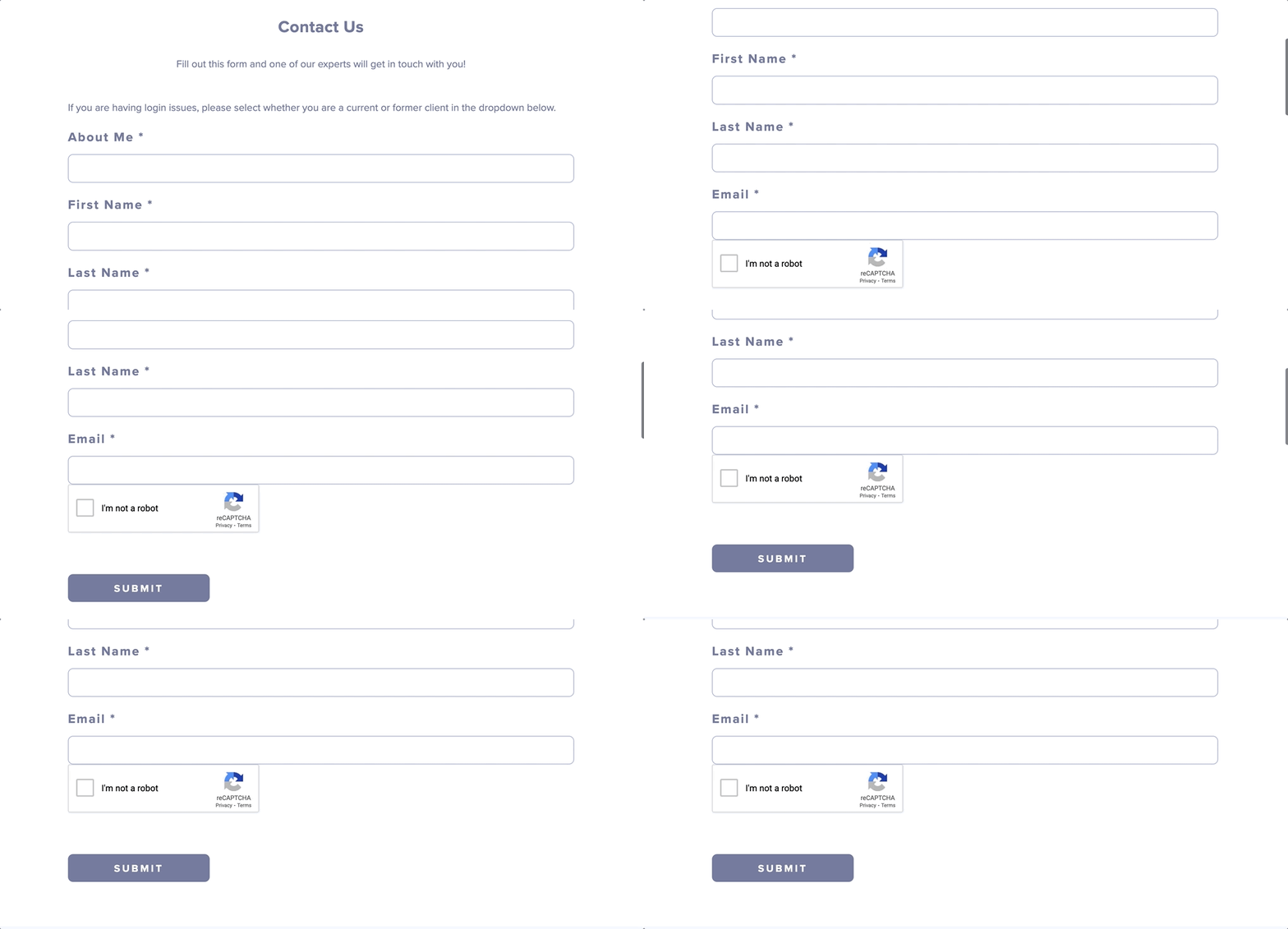
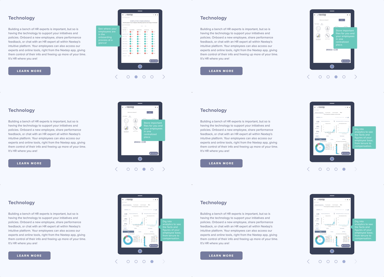
Modules
Created multiple modules that would be repeated in other sections of the website. This allowed for more efficiency in building the website.


