Dr. Squatch PDP
Redesigning a modular product description page to handle new products and bundles, while upgrading visuals.
Client
Dr. Squatch
Role
Lead Product Designer
Industries
Men's Hygiene Products
Year
2024
BACKGROUND
The future was already here
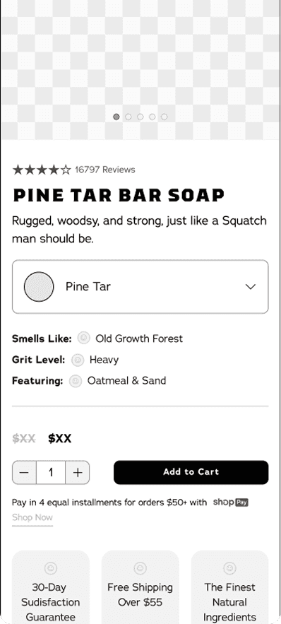
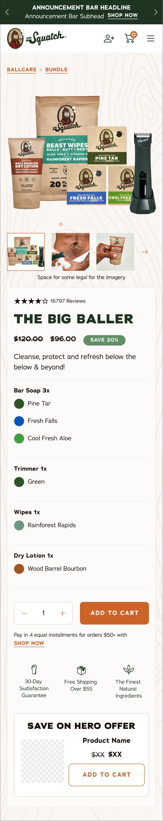
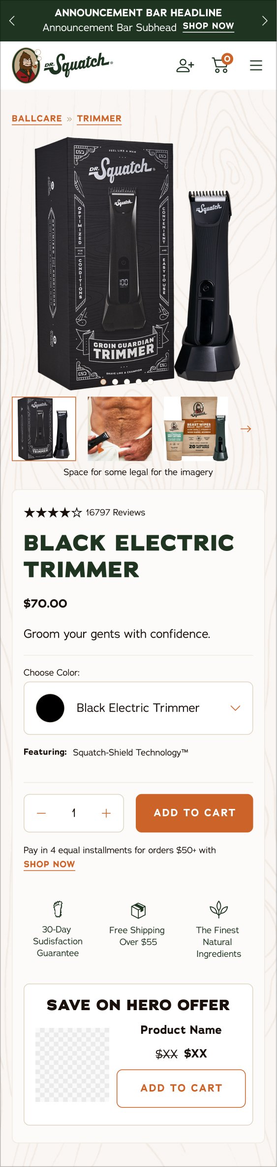
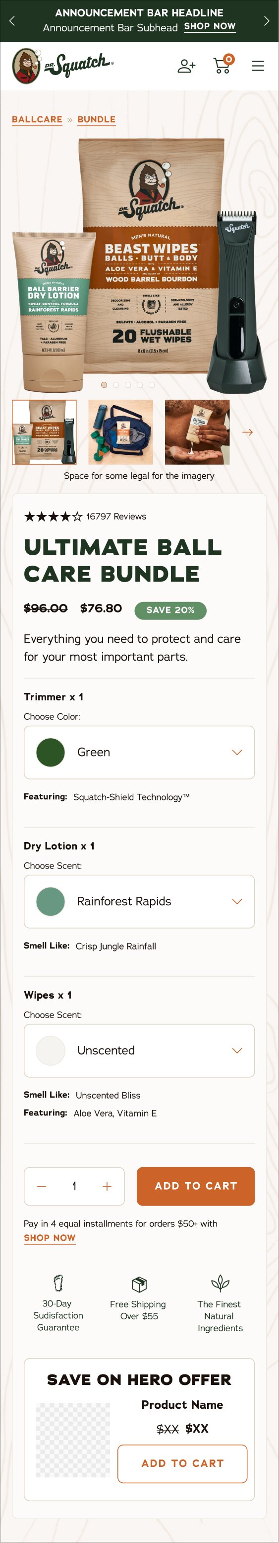
Dr. Squatch was launching a new category men’s personal hygiene (quickly followed by another new product Body Wash) which required a new PDP user interface. It was the Buy Box area that specifically need to be revamped so that there was the ability to select multiple options of scents, colors, and more for bundles and products.
The PDPs all had different information architecture/different templates for different product categories, this was not ideal for (1) users or (2) the engineering team. The engineering team was making bandaid fixes each launch to support marketing asks for PDP.
The PDP also lacked personality and branding, a huge misstep for a brand that was so popular and had a loyal base.
THE PROBLEM
More products = more problems
The PDP template was very outdated and not consumer friendly and was not built to have the necessary optionality for upcoming or future launches. The deadline for this to be designed and built was one month.
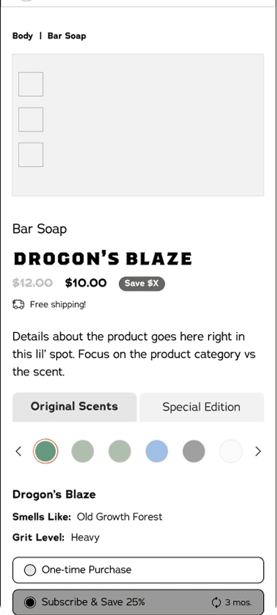
Previous bar soap PDP page that traps users into one scent.

Goal 1
Goal 2
Goal 3
Create consistency & optionality for consumers
Create a template that was forward thinking
Update look and feel to reflect branding
Have consistent information hierarchy and order for every PDP
Introduce user best practices
Introduce optionality
the ability to select from multiple scents/flavors
the ability to choose quantity
Create a modular template that followed the same structure so engineering would not have to do bandaid fixes for every new launch
Have a PDP that considered all products and product combinations as well as future launches
Have PDP reflect Dr. Squatch brand personality (as Dr. Squatch had a very loyal consumer base)
Update to reflect scent variety (a huge selling point)
Elevate look and feel to reflect higher pricing
DISCOVERY & RESEARCH
Complicated marketing = complications for consumers
Marketing at Dr. Squatch dictates how products are sold or bundled. This creates a lot of complications as it is not consumer or product focused. It also requires a lot of different types of PDPs to house the information.
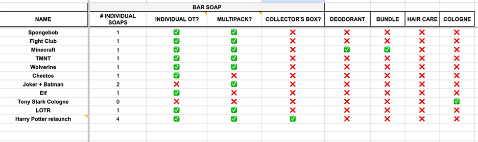
Another complication is the sheer amount of scents Dr. Squatch offers. For bar soap, there are over 40 scents, which if someone is buying a 9 pack of individual scents, that is a lot of decisions to make. It is also a lot of information to house on a single PDP.
For the first time matrixes were created (by me and my product manager) that detailed all categories, all products, all scents/flavors/colors, and all purchasing combinations).
We did have one really great thing going for us and that's the stans! Dr. Squatch's fans often participate in research as they are avid lovers of the brand, so we had a lot of information and user testing to work off of, but unfortunately a lot of the findings had never been implemented. We set out to change that.
Customer Research
Lack of optionality: Consumers were “trapped” into one product page causing rage clicks, and were not able to select a different scent or view other scents.
Consumer testing showed one of the biggest draws to the brand was the variety of scents, specifically the 40+ scents in Bar Soap!
Quality selections: Quality selection is limited to 1, 2, or 3, which limited the consumer’s choices
It was not consistent which was frustrating to consumers
It also didn’t benefit users in terms of pricing to select one of the limited options, one of the main reasons it was implemented, and instead confused them
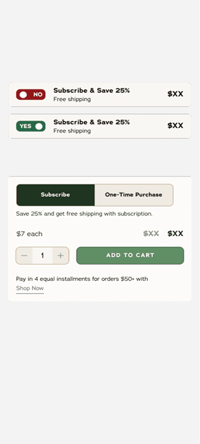
Subscription benefits: Consumers did not understand why they should choose the subscription option over the one time selection.
*This was a missed opportunity as subscription was one of the biggest business goals.
Competitor Research & Inspiration
Competitors had really jumped ahead in usability and in branding
Optionality was found within every single competitor site
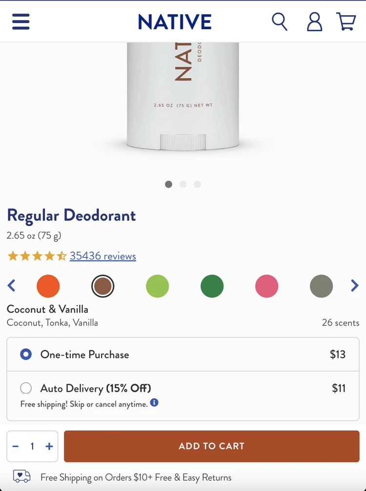
Native
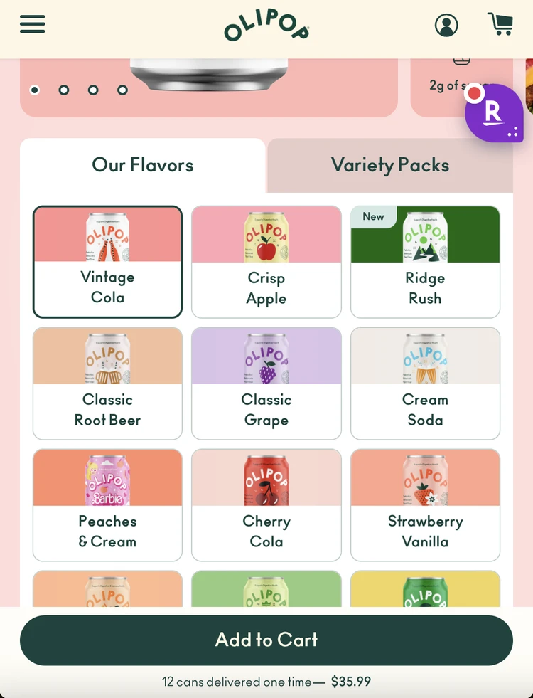
Ollipop
Javy Coffee
Native was a north star in great user experience. They allow users to select scents on the PDP page, their subscription process is simplified, and they allow users to select their own quantity.
Ollipop has amazing and colorful branding, that helps users identify the scent. Ollipop makes every single flavor stand out.
Javy Coffee had a great user experience when it came to subscriptions, explaining all the benefits.

IDEATION
Exploration
Exploring new ways to present information in the PDP.
Some notes on design decisions:
I knew pretty quickly the direction I wanted to go on most of these, but need to assure my partners that my instincts were correct. So we did some testing, which I'm never opposed to!
Scent Selection Exploration
With over 40+ scents alone for bar soap the dropdown was the best option of the bunch, especially on mobile.
All Scents Shown
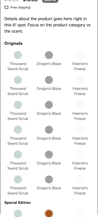
We explored having all scents visible within the PDP. For bar soaps the max amount for Core Scents was 16. We quickly realized this would be far too many scents in one space.
This was most used in our competitor space*
Tabs
We realized a solution could be to use tabs to switch between the scents. This would divide up the 16 core scents and the 10+ special edition scents.
This solution required a lot of selections on the consumer’s part & also didn’t clearly display what the scents were - just the colors.
Dropdown
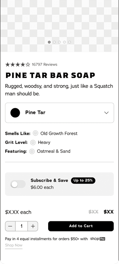
It quickly became apparent that the dropdown was a great solution. Having the scent color and description side by side made the selection clear. Also going into the dropdown allows a user to easily select another scent.
Subscription Selection Exploration
Finessing the subscription section a bit more to explain the benefits was the clear winner.
Subscription Benefits
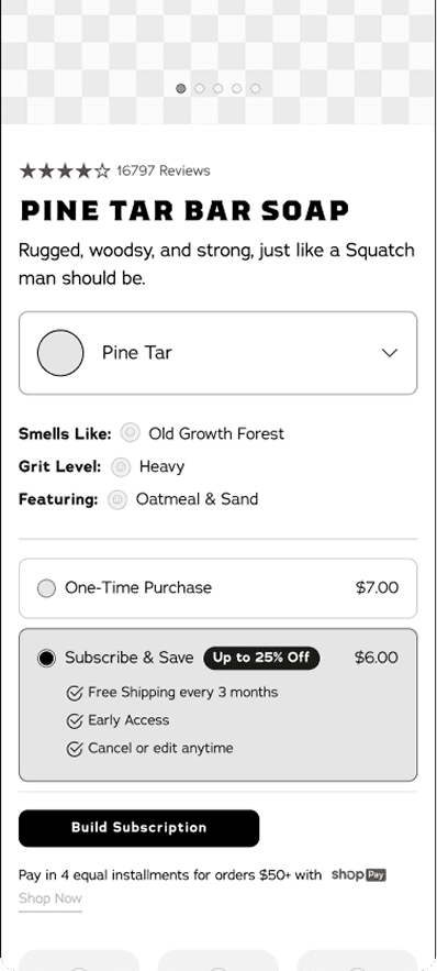
Highlight the subscription benefits for the consumer.
Testing showed that easily explaining the subscription and it’s value to consumers made consumers 2x more likely to select subscription.
Bulk Order
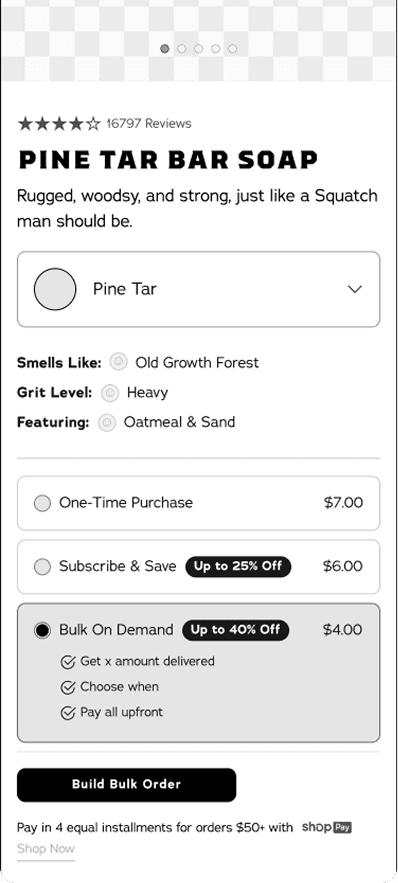
Many consumers loved to buy massive amounts of products (bar soap especially) at once. With a deep discount this also seemed to be an attractive offer.
While an interesting concept, this option could confuse consumers even more, something that had been coming up in our feedback of the site.
No Subscription
Another option we looked at was removing the subscription all together.
This would force users to select our subscription model through the navigation menu.
While a valid option, due to the financial implications of not having subscriptions available through the site, it was quickly eliminated.
PDP Details Exploration
Looking at all the ways we could possibly improve the experience.
Subscription Toggle
I explored making the radial selector for subscription a possible toggle. However testing revealed that consumers felt the radial button was easier to understand.
Dropdown SIZING WITH SPACE FOR COLOR
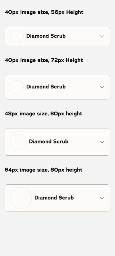
Explored sizing for the dropdown & the ability to have a color or icon next to the scent/flavor.
Counter VS QUANTITY SELECTOR
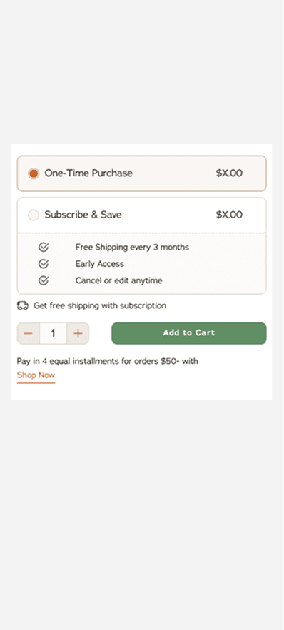
Previously we had a 1 or 2 or 3 quantity selector, or a quantity selector with pre-chosen options. Consumers did not like that & was one of the first changes I made within the new mocks.
UX
Modules for Buy Box and PDP
Due to multiple needs for different product marketing for different products, bundles and categories, it soon became clear that we would need a flexible PDP.
By creating different modules, which could be used for multiple use cases, this PDP template could be used over and over.
These modules can be used for over 7 categories and 50 products, as well as multi-selector bundles.
Key Features were implemented:
Scent selection
Purchasing selection - subscriptions
Quantity and subscription
Exploring look & feel to be more on brand and elevated
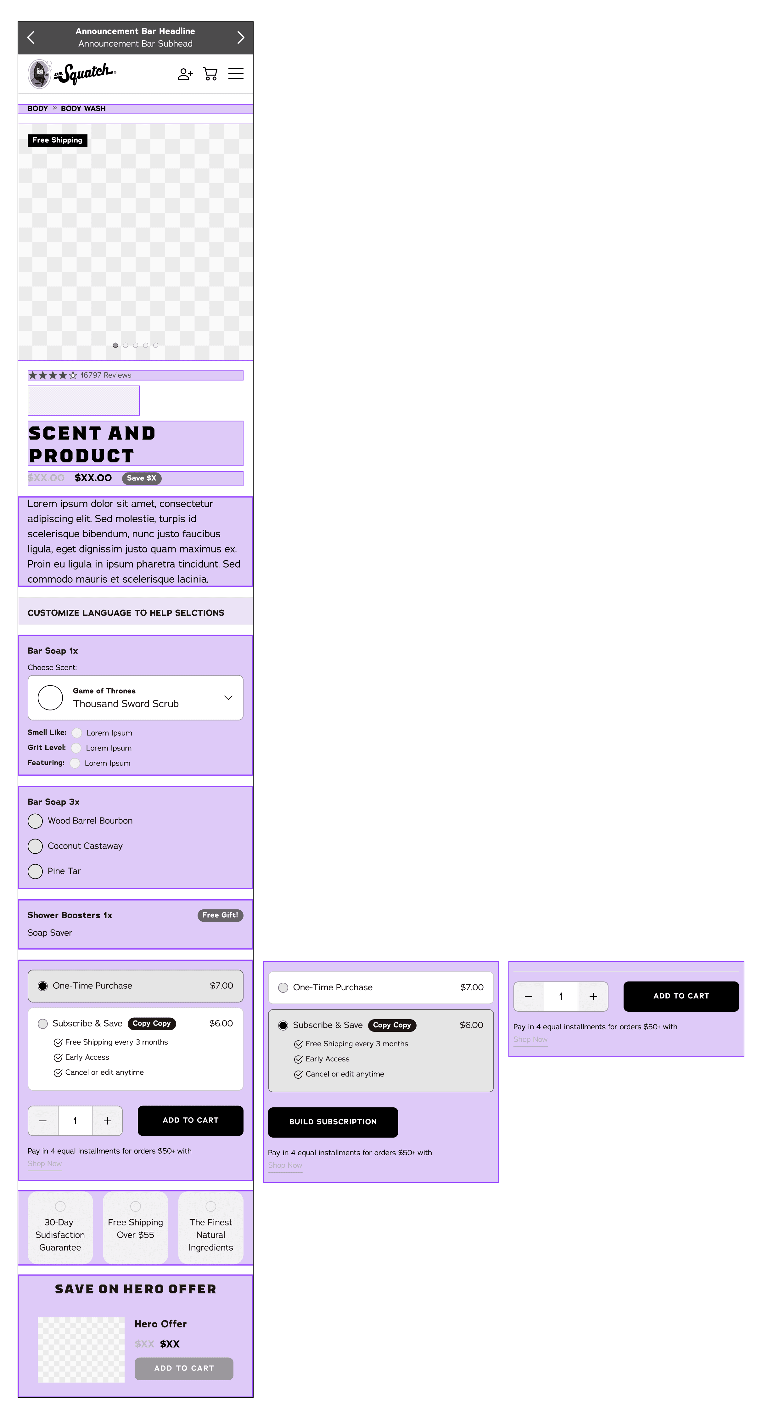
PDP Templates for Merchandising Use Cases
PDP Page needed to cover several use cases in order to be successful, as well as multiple breakpoints.
VISUAL DESIGN
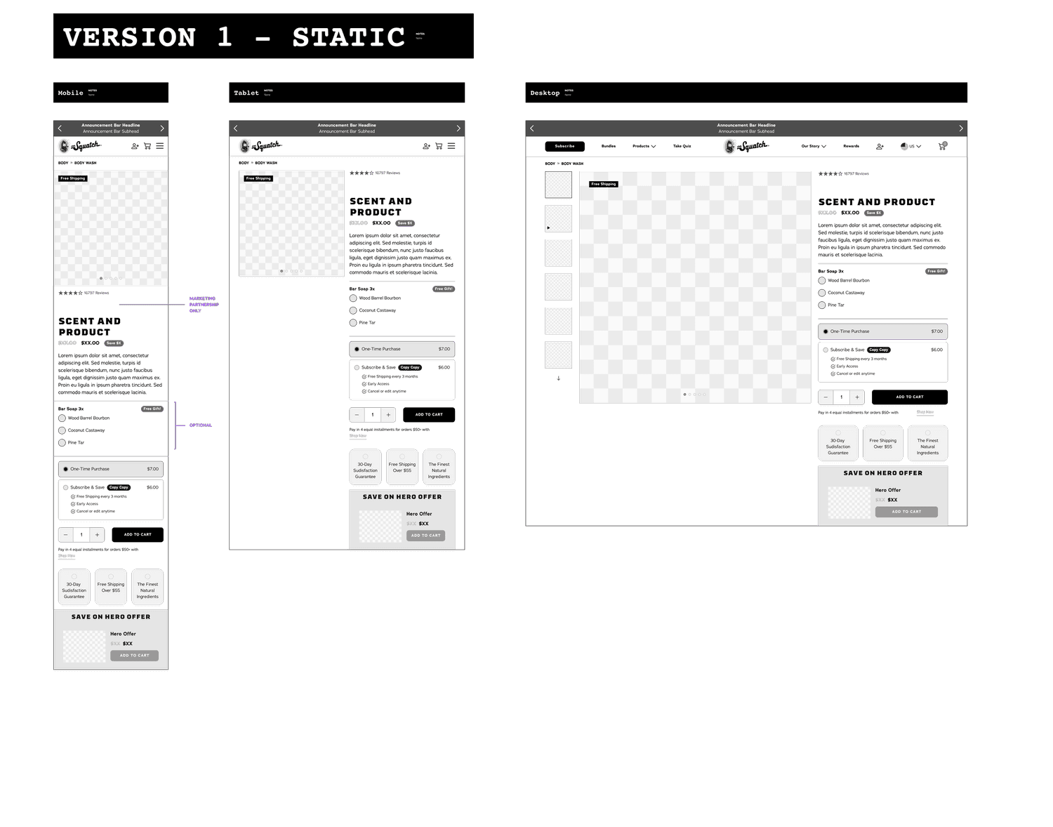
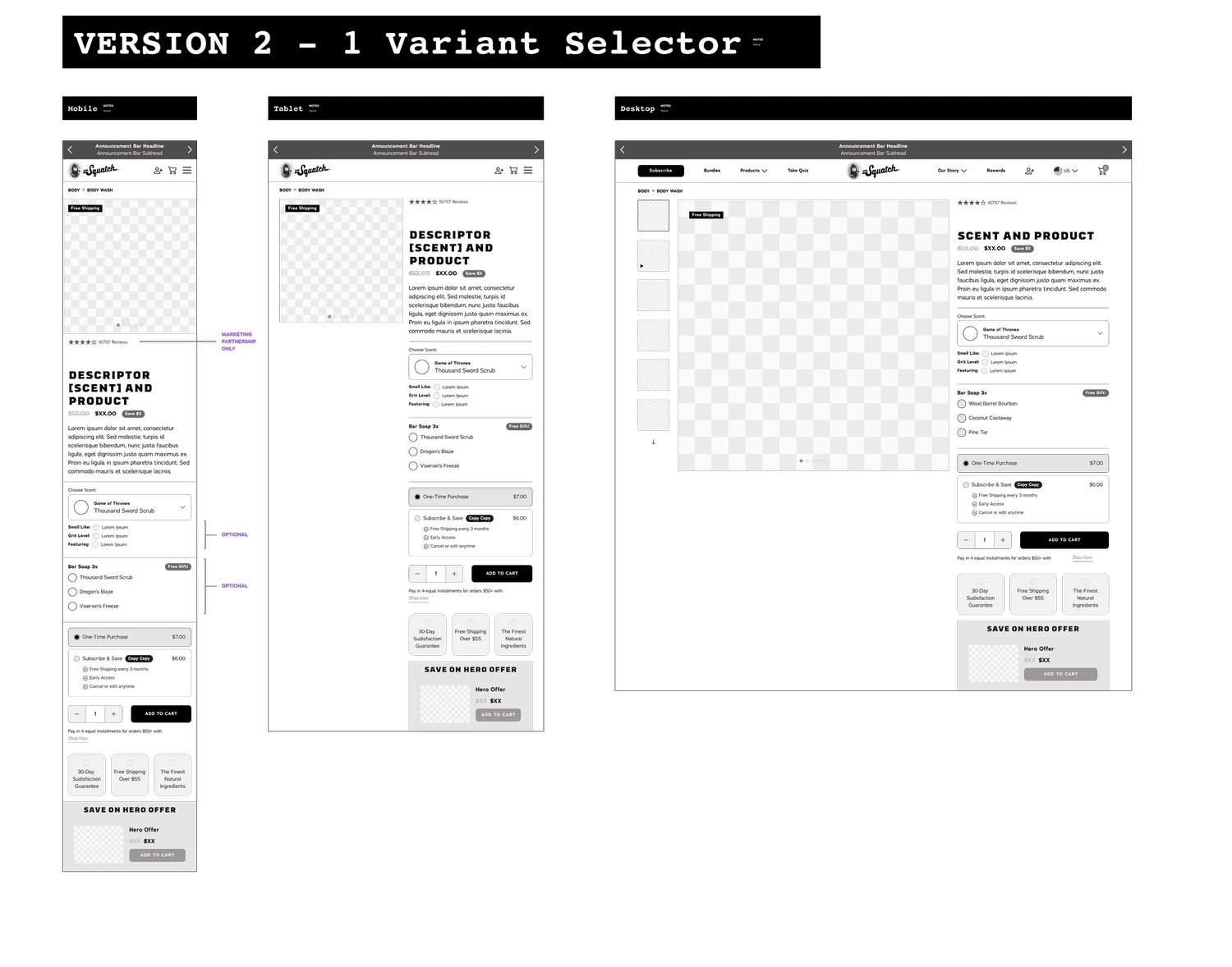
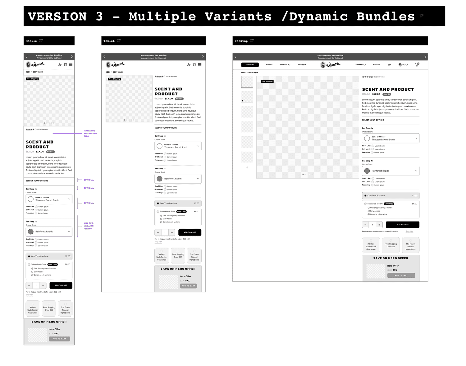
High fidelity mocks
High Fidelity Templates Types:
1. Marketing Partnerships
2. Core Products
Marketing partnerships would have specialty backgrounds and color highlights, as well as partner logo placement.
Accounting for multiple breakpoints.
High Fidelity Templates
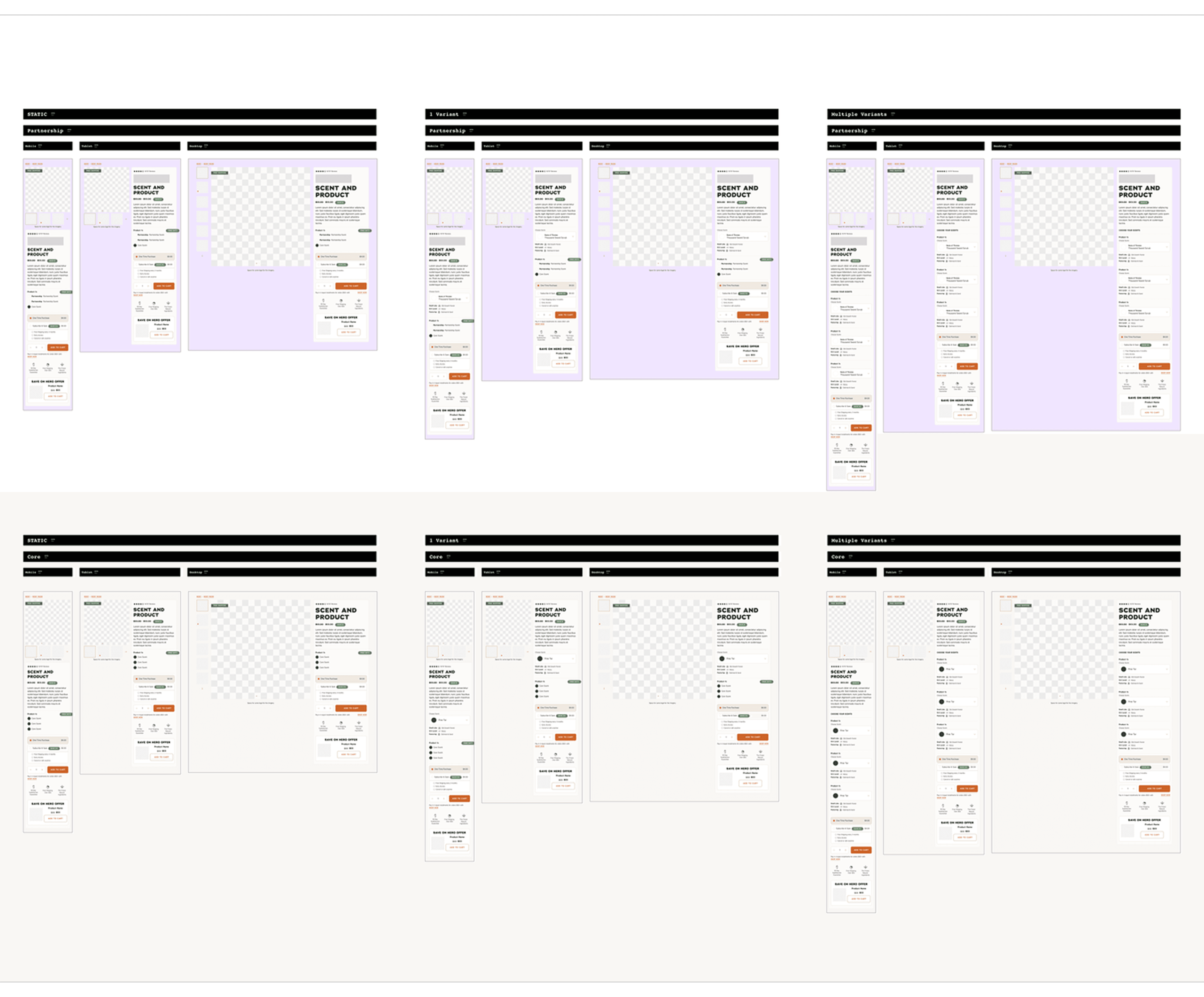
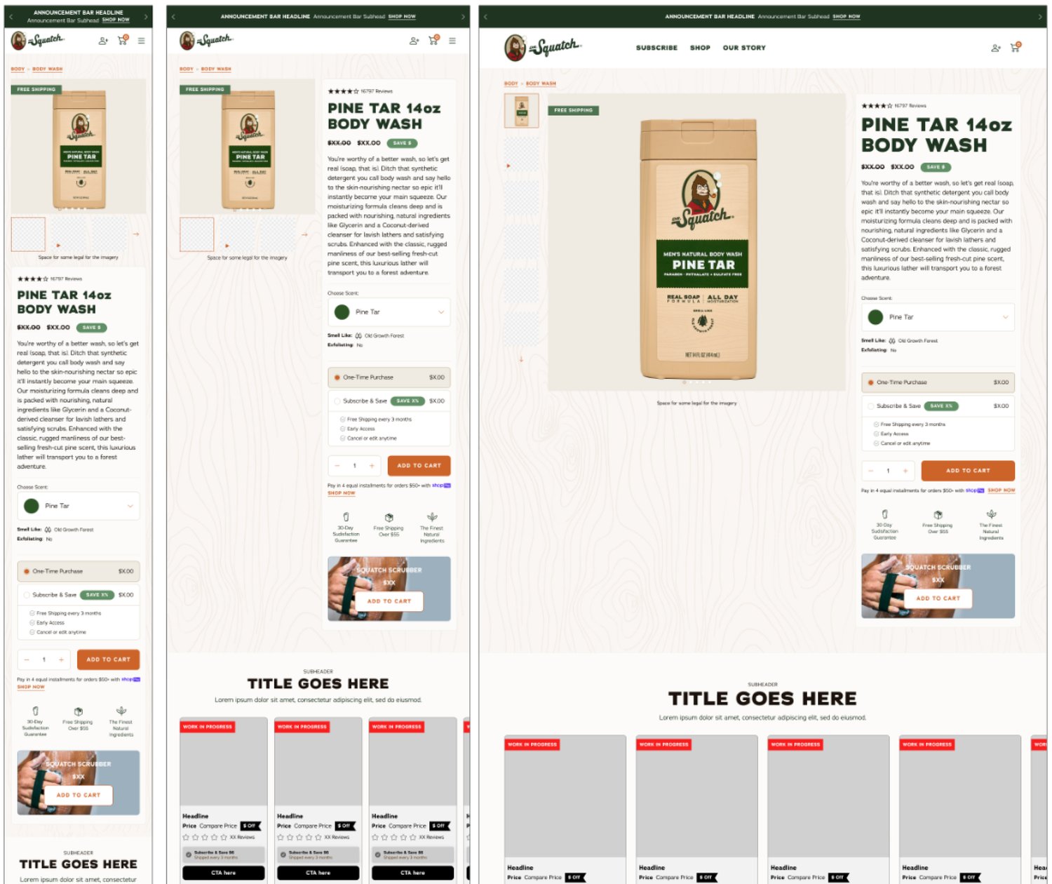
High Fidelity mocks for Male Hygiene Launch
VERSIOn 1
STATIC
VERSIOn 2
ONE VARIANT SELECTOR
VERSIOn 3
MULTI VARIANT SELECTOR
High Fidelity mocks for Body Wash Launch

LAUNCH I
Male Hygiene Launch
The first test to see if the templates worked was the Male Hygiene Launch.
Thankfully the launch did well!

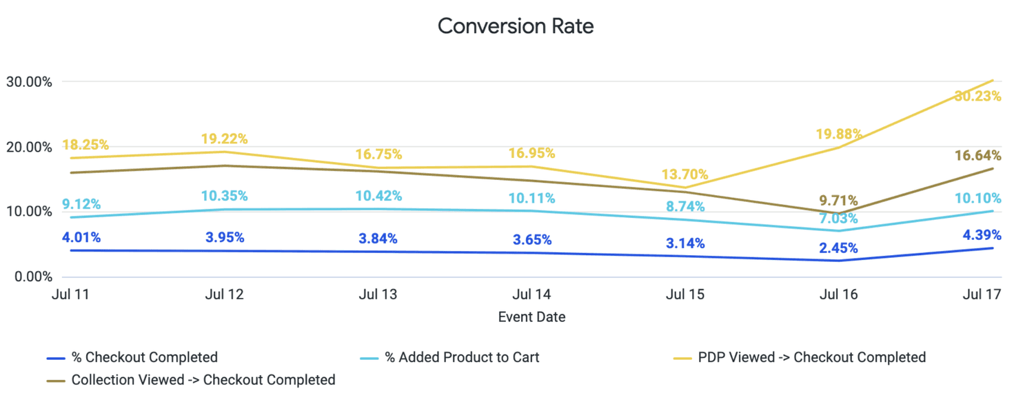
Male Hygiene Launch Results
Launched July 16th, 2024
EXTERNAL
CVR rates for PDPs went from 13.70% to 30.23% in terms of viewing a PDP and then completing checkout
While a new launch always bumps the numbers up a bit, this jump reaffirmed a lot of the decision made in the PDP
The male hygiene launch was the highest ROI category the month of launch, and our results were above our targets
INTERNAL
Engineers were happy!
Marketing was happy!
LAUNCH II
Body Wash Launch
The second test was the Body Wash launch two months later.

Body Wash Launch Results
Launched September 13. 2024
I had left by this time but the launch garnered a lot of media attention, and not all of it was positive. There were also concerns before the launch about even proposing a body wash category as it went against its most popular product, the bar soap. However many more scents have been released so it must have sold well.


RESULTS
Success?
I'd say this was one of the more successful projects I've done in such a short amount of time (2 months start to finish).
The fact these templates are still being used over a year later, in multiple launches both marketing and core, proves that they work.