Overview
With the launch of a new category of products the Dr. Squatch nav had been officially outgrown. This also required revamping the site architecture and what categories all the products lived under.
There was also a lack of consumer focused considerations as well as a lack of ADA compliance especially on mobile, that was my intention to update.
-
Lead Product Designer
-
1 Product Manager
1 UX Designer (I managed)
1 Engineer
-
1 month
GOALS
-
New customers were often frustrated by the site, unable to find the product they were interested in. This was hurting our CVR rates.
For returning customers, you can’t make a first impression twice, but it is important to improve the user experience of past consumers.
-
Users felt the site was unorganized, and it was not easy to find the products they were looking for.
-
Many parts of the user experience, especially the quick nav, had text that was too small (10px) and images that made it hard to discern what it was.
-
One of the main directives of the project was to create a navigation that would allow for product and category expansion as several more were planned. Also by making the nav content modeled, it allowed for non engineers to add to the navigation.
01 Past Navigation
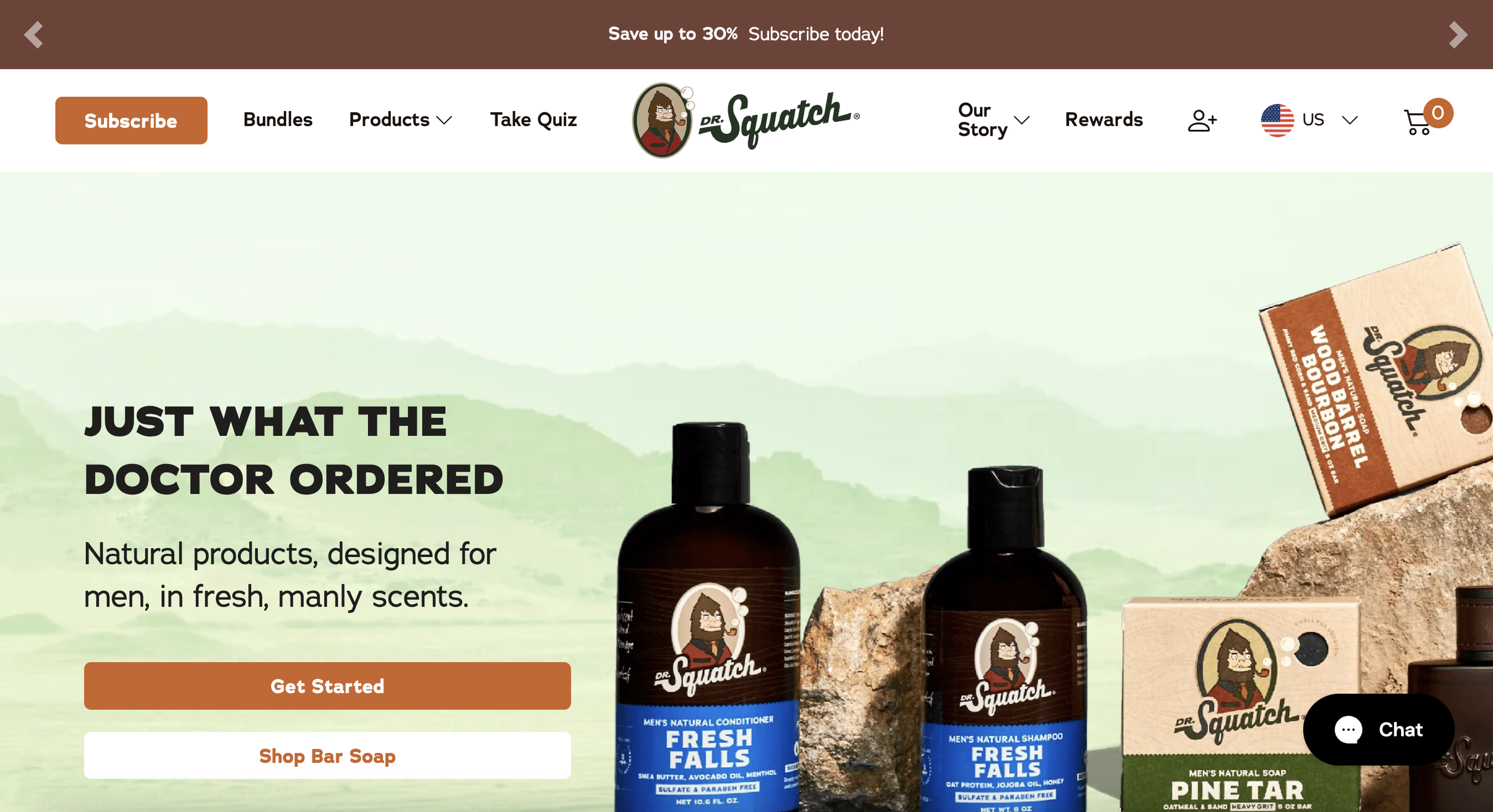
Navigation for Dr. Squatch was designed by marketing initiatives vs. a product team, creating a bloated and confusing navigation.
Heatmap data showed that new visitors like to go straight to browsing products via the quick nav (on mobile) and the main menu/nav (on desktop and mobile).
○ According to Heap, 60% of unique mobile nav clicks go to the quick nav and 24% go to the hamburger menu/sub-nav. (The quick nav cannibilized the hamburger menu/sub nav clicks)
○ According to Heap, 38% of unique desktop nav clicks go to the Products link.
Previous Mobile - Main Navigation
Previous Mobile - Quick Nav
According to Heap, 60% of unique mobile nav clicks go to the quick nav and 24% go to the hamburger menu/sub-nav.
This was an issue, because the quick nav cannibilized the hamburger menu/sub nav clicks, was too bloated for the amount of products/categories it housed, had no order of organization, and was not ADA compliant (text was hard to read/images hard to see). It was a source of frustration for users once they entered the quick nav.
Previous Desktop - Main Navigation
Previous Desktop - Sub Navigation
Previous Consumer Journey
The past customer journey was extremely convoluted and did not prioritize the consumer.
The desktop and mobile breakpoints also provided extremely different user journeys, making the site feel inconsistent.
02 Research & Discovery
Most Popular Pages
To redefine the categories and what would be prioritized on the nav we did an audit of the most popular pages to figure out what should be prioritized in the nav. We also did some heatmap testing of what nav selections were the most popular.
The most popular pages were: Soap, Deo, and Bundles
Consumer Frustrations (Findings)
-

Too Many Options
The previous main nav had over 9 clickable areas, two with sub navs. Some, including an (outdated) quiz, bounced the user from the site.
-

Lack of Organization
Consumers were unsure what products lived under what categories (especially on desktop).
Overall insight was to redesign the navigation to make it more visual and improve the hierarchy and visibility of secondary products (Candles, Cologne, Beard Oil, etc.). -

Mobile Legibility
The mobile text was hard to read at 10px, far below the 15px ADA compliance requirement.
Images were also so small that it was hard for users to know what was in the picture.
-

Lack of Branding
Unlike our sister brand Jukebox, there was a lack of branding in the navigation, it was a white background and black text. This did not make the site feel “premium” which caused consumers to feel that prices were too high.
Organization of Categories
Competitor research and analysis alongside Product and CX teams recommend a mixed categorization / discovery path.
New Customer Journey Based On New Organization + Most Popular Links
By organizing the information and keeping the main nav (top bar) more simplified, it helps consumers choose their journey, making product decisions easier. We also added a “featured” section to house new launches and most popular items such as Bar Soap and Deo.
Competitors & Inspiration
-
Native Desktop
Native was a north star in great user experience. For their desktop menu they had each category open and on hover showed all of the options.

-
Harry's Desktop
Harry’s also had an open menu, but had everything very organized in categories. We felt that this was closer to what we needed as the sheer amount of products was a lot to show.

-
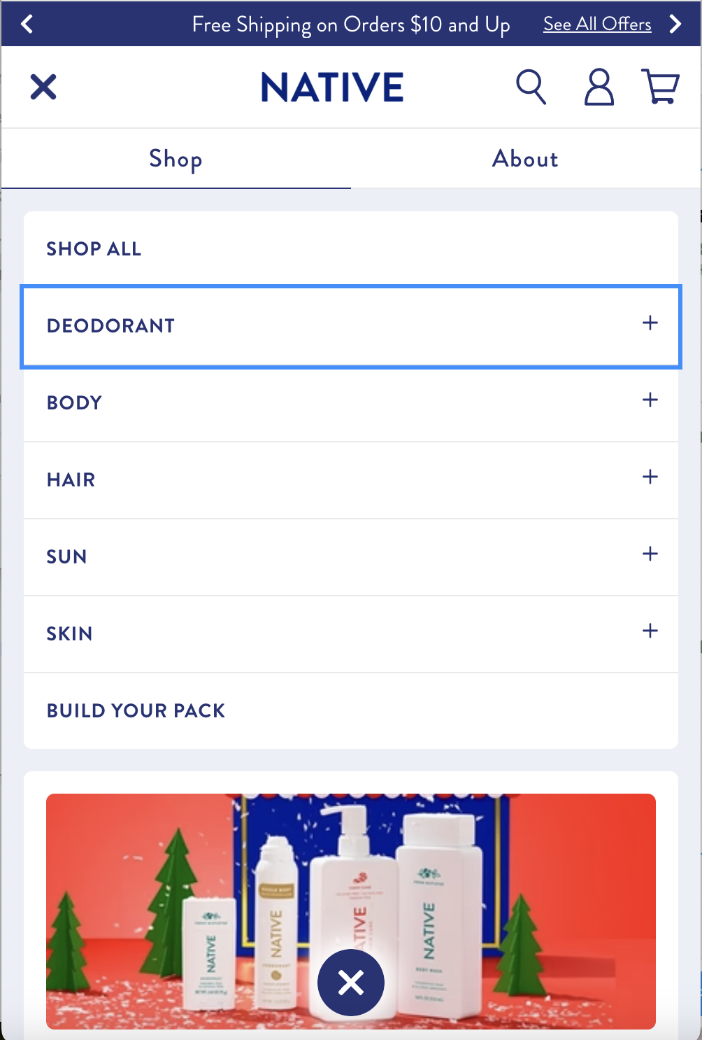
Native Mobile
Native had a collapsed mobile experience keeping everything very condensed, but also had slight imagery making it pop.

-
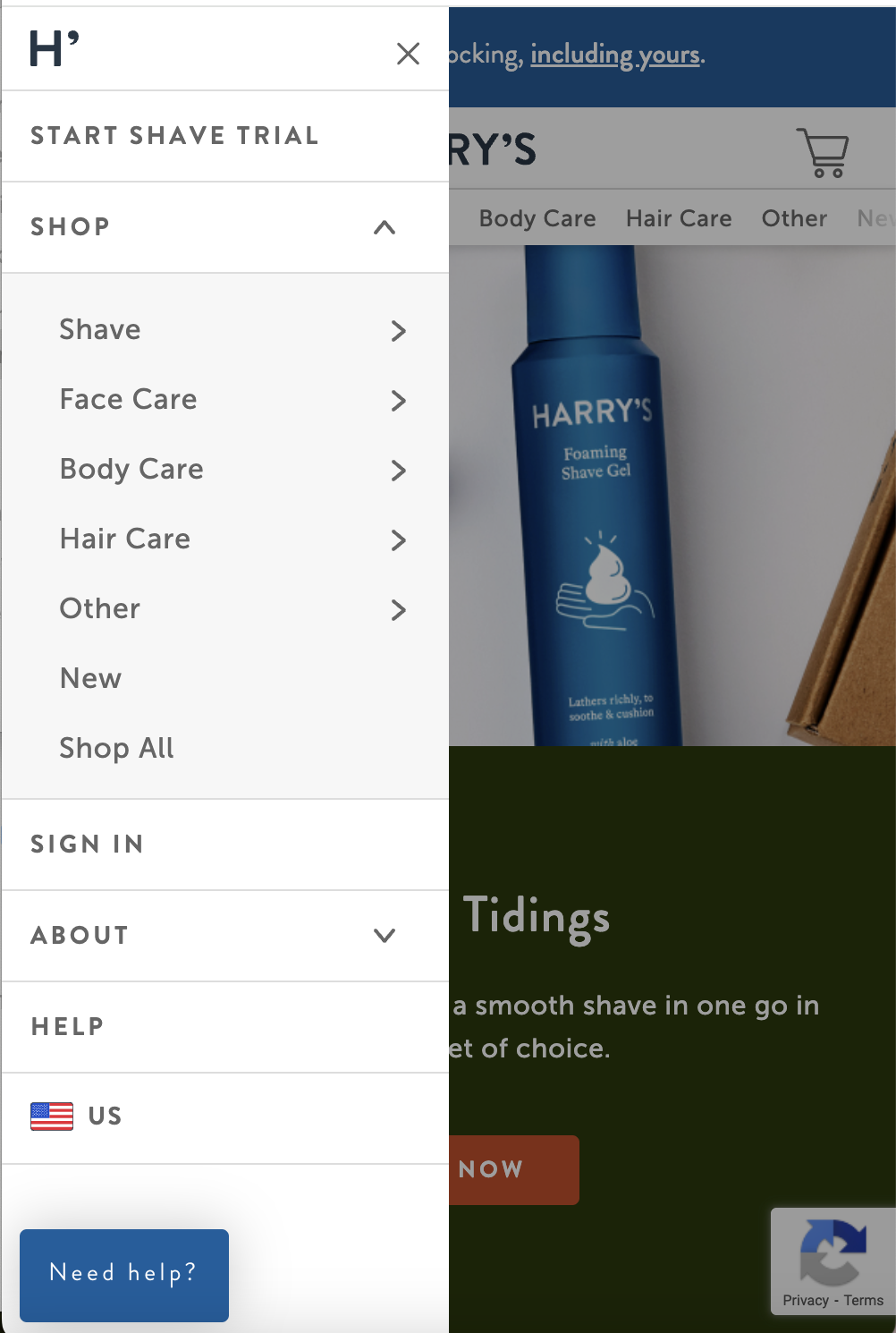
Harry's Mobile
Harry’s also had a collapsed menu, but had a great hierarchy of sub categories.

03 Ideation
Desktop Menu - Open vs. Closed
-
Open Menu
Open menu has all the categories open on land. It allows a user to view all the categories before clicking into the menu.
Once a category is selected the menu opens with all the child categories with images. Example shown: Body
-
Closed Menu
Consumers are not able to view categories until the shop all is selected. However the benefit is that all of the categories and child categories are shown at once.

Mobile/Tablet Menu - Parent Categories Only or Both Parent & Child Categories
-
Parent Categories Only
A simplified mobile menu, that focuses more on directing users to the product landing pages of the category.

-
Both Parent & Child Categories
Both the parent and child categories are present, with only the parent categories open when the menu is tapped on. This option allows views to see all the available child categories, helping them narrow down their choices.
Although I found that this option to be overwhelming for users, especially for mobile, due to marketing demands, this was the chosen direction.
04 High Fidelity Mocks
Branding
Before designing high-fidelity mocks, I had to do some branding work to keep the design clean & high end (these soaps are expensive!)
Previously the site had over 7 greens on the homepage alone, and the creation of the nav required translating some of the print/packaging branding to the web.
This resulted in a whole overhaul of the Design Library and website branding.
High Fidelity Mocks


x
05 CMS
CMS
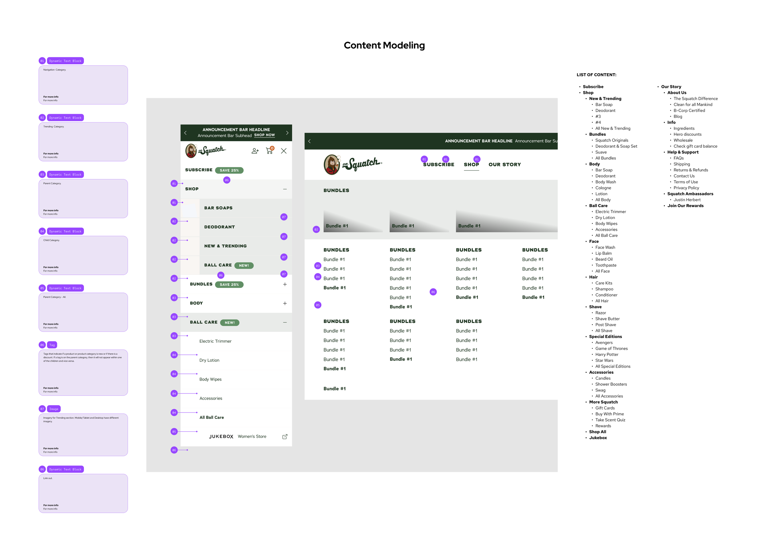
Part of designing this Nav was to create the ability to make the nav easily editable so that marketing people could add products, categories, and change up the features section highlighting upcoming products and launches.
This was done by creating a CMS catalogue.
06 Results
Results - CVR
NEW CVR
The CVR jumped 7/17 the day the launch, from a 1.03% to a 2.63% showing a strong start to the new navigation. It also remained above the minimum 1% CVR.
RETURNING CVR
While our returning CVR did jump up to 7.16% the day of launch 7/17 from the previous day of 3.65%, it did not make a huge difference in terms of the general average.
ABT - Always Be Testing
Even though we felt very confident about the direction of the menu, we base results on the data. Even after positive feedback we kept plans in place to keep testing.
GOALS ACCOMPLISHED
Addressing User Frustrations
Consumers had a lot of frustrations with the current site, and we addressed that by:
Simplifying the Main Nav: Cutting down the previous 9 selections to 5, prioritizing the most important user journeys
Organization: Organizing the products into categories that make sense to consumers
Cutting Quick Nav: By cutting the quick nav, even though it was used often with users, we made the hamburger menu the main navigation, allowing for users to see more products at once, and having them be organized.
Elevating the experience: By making the nav have some branding elements it gave the whole experience a more premium feel
ADA Compliance
By cutting the quick nav, even though it was used often with users, it helped increase ADA compliance by a significant amount.
Branding decisions were also made with ADA compliance in mind, such as higher contrast.
Build for the Future
This was accomplished in several ways
CMS: Allowing for the easy addition of more categories/products by non-engineers
Categorization: Having categories be well defined, as well as the user journey for those products simplified, allows for the expansion of more categories and products
07 Learnings & Reflections
Learnings & Reflections
KPIs
For this project, the KPIs were defined before I joined the project. I would’ve updated them to include more nav focused results, such as CTR.
Marketing vs. Product
This project included many stakeholders, most of them with a marketing mindset. Often times the best user experience was not selected due to the majority being marketing people. However, when compared to the previous iteration this nav was a big improvement, and this project also helped show that good product can equal better marketing results, opening the doors to more collaboration between the two teams.


