Hyundai
Modernizing the car buying user journey, by creating a user empowered purchasing process in times of low inventory.
Client
Hyundai
Role
Senior UX Designer
Industries
Automotive
Year
2025
BACKGROUND
The car buying journey is broken,
but COVID made it worse
Since COVID, purchasing vehicles has changed due to low inventory, and a lack of being able to customize. Many consumers will go through a typical build process, customizing a vehicle, only for it to be a 6+ month wait for that vehicle or being sent directly to the current inventory page.
THE PROBLEM
Forced choices create unhappy consumers
Unfortunately most vehicle websites force consumers to pick a model, then a trim, taking them down the funnel of inventory of car purchasing without a lot of filters or information to help them make their decisions along the way. This also doesn't allow for model-to-model comparisons. The lack of filtering options also hurts a consumer's ability to make an educated decision, and often takes them down a convoluted journey to a vehicle they may not be interested in.
User testing showed that many consumers are suddenly at the inventory page for a vehicle that doesn’t fit some of their basic needs.
Consumers more than ever need the ability to view multiple models & trims to focus on the features that they need in a vehicle, however most traditional user journeys force a user to pick a model and then pick trims to view inventory.
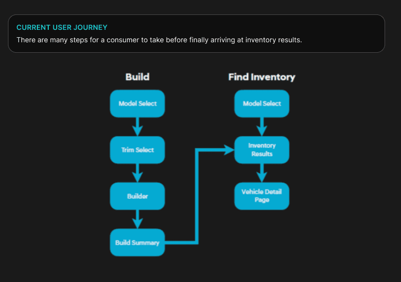
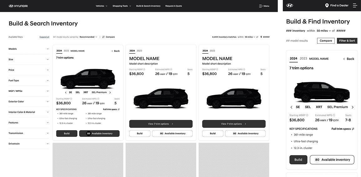
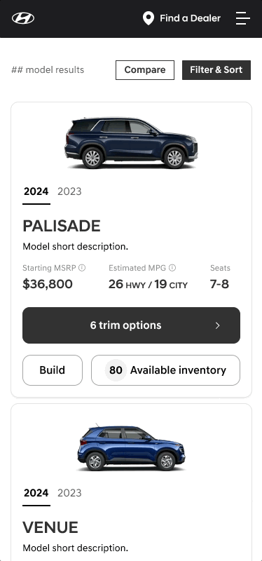
This was the user journey on Hyundai to select a model.
Defining the need
We needed to move past traditional user journeys and create a way consumers could easily compare and filter models and trims of vehicles.
Goal 1
Goal 2
Goal 3
Create a new user journey experience for vehicle purchasing that is unique from competitors
Re-design the model & trim cards for an easier ability to compare options
Update vehicle information to better reflect the priorities of the consumer
Consumers are forced to pick a model, then a trim, and taken to inventory with little to no ability to filter other options
Consumers felt frustrated by lack of options, and “forced choices” for such an expensive process
Model cards and trim cards have little to no information for comparison except pricing
Trim cards are confusing to consumers as many do not contain information that allows easy comparison within a model
Car buying is often a lengthy process, the lack of information delays the purchasing of a vehicle
Consumers are more feature focused than previously thought, prioritizing some features over pricing
Size of vehicle is a high priority for a consumer, but is not reflected in the car buying journey
DISCOVERY & RESEARCH
Discovery
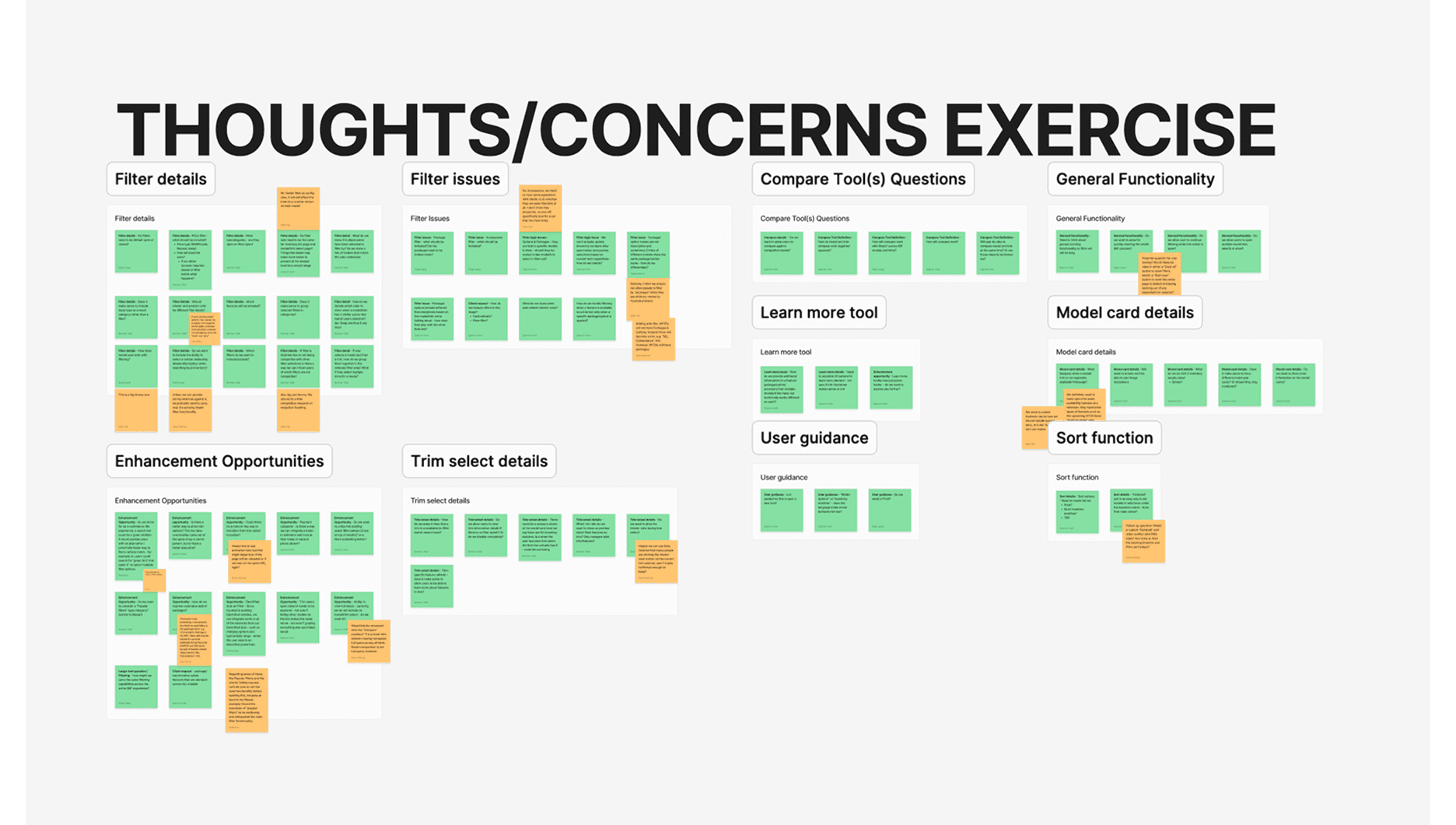
There was a long discovery phase of heavy research that included; competitor research, research on our own site, research into tools/features. The team did a lot of competitor research and internal research to see what were the top priorities for consumers.
Research on vehicle purchasing
Car buying is often a long and drawn out process, usually taking consumers many months
Bigger purchase + more people involved = longer purchase
Consumers felt frustrated by not being able compare multiple models at once, as often times they felt similar, or one wasn’t available in their area
Certain information (that has not traditionally added to automative sites) are more important to consumers than originally thought & a major barrier to purchasing. A great example was number of seats, “I can’t buy a car if all my kids don’t fit in it”.
Research on Hyundai consumers
70% of Hyundai users are on desktop device to browse and compare vehicles
66% of Hyundai car purchasers are 55+
Hyundai clients wanted something completely different from traditional car websites
Research on current Hyundai site
The team did a lot of competitor research and internal research to see what were the top priorities for consumers.

Qualitative findings:
Consumers felt frustrated by not being able compare multiple models at once, as often times they felt similar, or if one wasn’t available in their area.
→ They felt that the filters weren’t robust enough at the beginning and the lack of a compare feature upfront was also an issue.Certain information (that has not traditionally added to automative sites) are more important to consumers than originally thought.
→ Number of seats was a major barrier to purchasing along with other selections. These features were vital to making a final decision.
Ex. “I can’t buy a car if all my kids don’t fit in it”Consumers were confused by trims, as some trims had features that were not present on trims of the same model. They felt confused by not knowing some of this information upfront.
→ They felt the Palisade was especially confusing as it has 7 trims, which is one of Hyundai’s top sellers.
Quantitative findings:
What percentage of users cross build/shop models?
32.11% on average
What percentage of users cross build/shop model years?
15.38% on average
UX DESIGN
User journey update
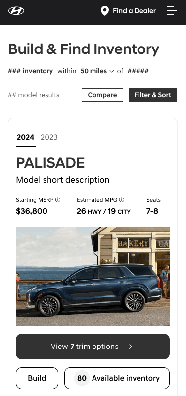
The current journey was very arduous & layered, focusing users to make selections with little to no benefits or the ability to change those selections. The updated the user journey takes the consumer directly to builder or inventory to help flatten the process.

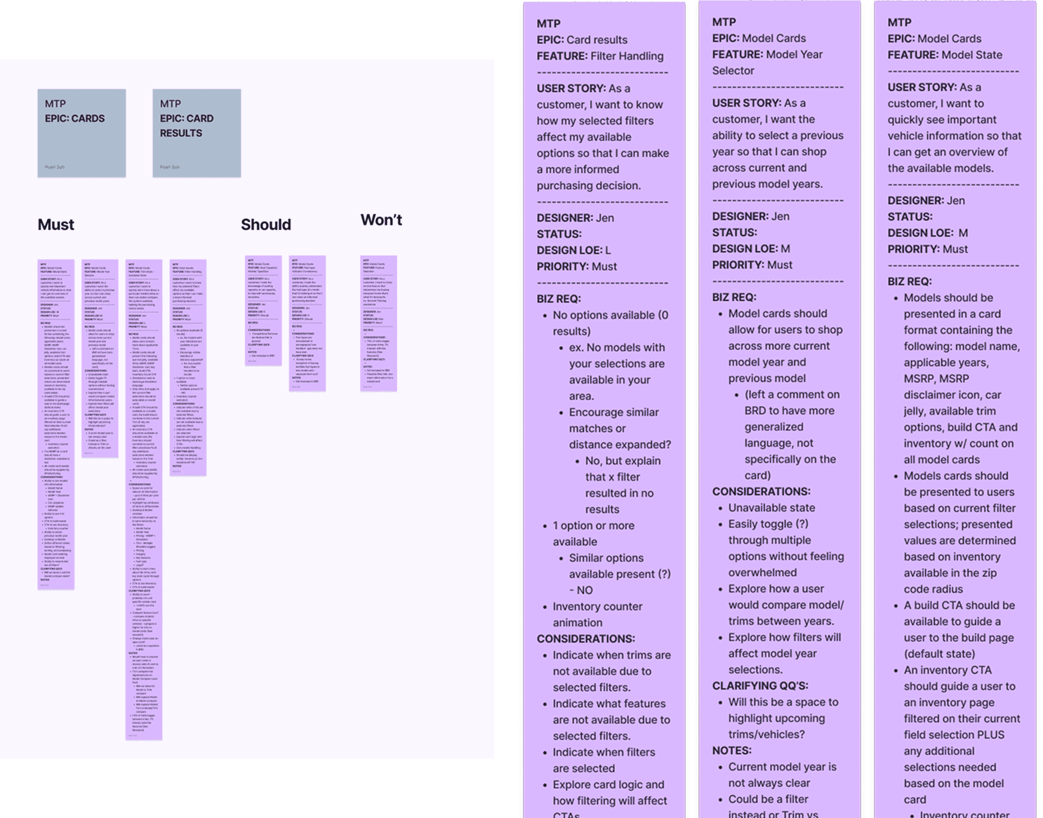
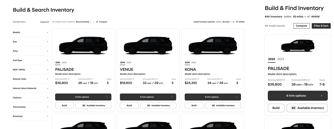
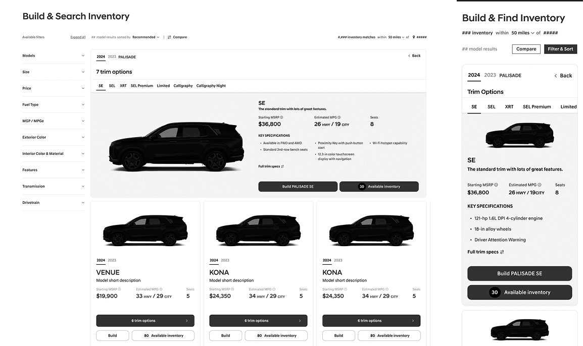
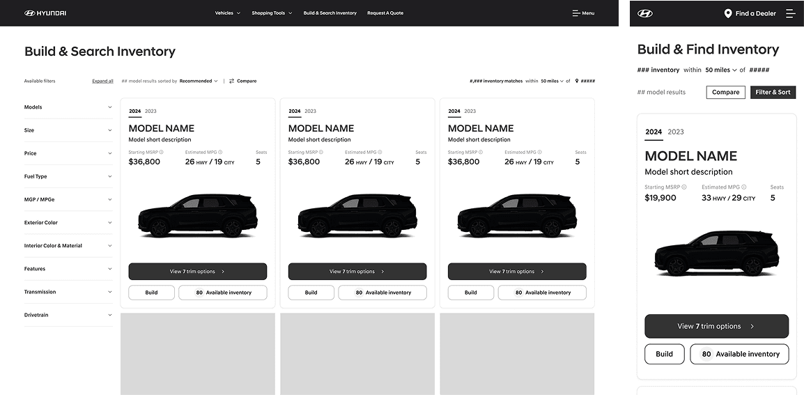
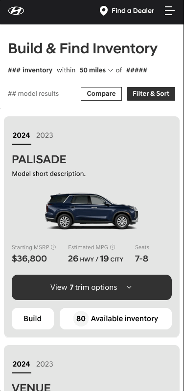
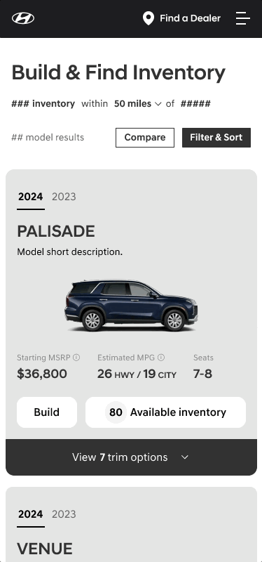
Model-trim card update
Would have to explore options as this is new to consumers
Adding more information on the card that is relevant to the user up front
Creating a model card that is easier to compare
Creating a trim card that is easier to compare
IDEATION
Re-invisioning model and trim cards by combining them into one
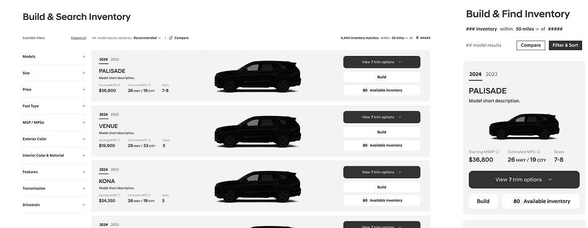
The current model of car buying user journey is to select a model card, then a trim card, which then go to the inventory page where there are inventory cards. This segmented process causes a lot of steps without a lot of reward. It also doesn’t allow consumers to compare models and trims based on filter selections.
I came up with 4 alternatives where model and trim cards are combined to solve this issue.
Some notes on design decisions:
70% of Hyundai users are on desktop device to browse and compare vehicles
66% of Hyundai car purchasers are 55+
Hyundai clients wanted something completely different from traditional car websites
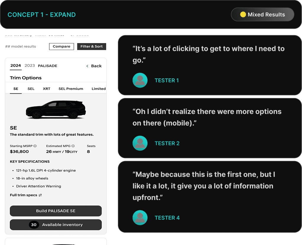
Concept 1: Expand
This design features a grid layout for model selection, with an inline expansion that shows one trim at a time. A top navigation bar allows users to switch between trims.
Starting State
On Trim Expand
BENEFITS
Allows for users to easily click through trims once in the model car expanded state.
Has real estate for a lot of information.
DRAWBACKS
While it provides additional specifications, users need to tab between trims and use the top navigation to compare.
UX takes up entire row, shifts a lot of cards around.
Mobile is especially crowded & not all trims are visible.
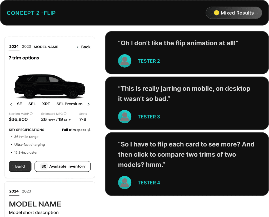
Concept 2: Flip
This design uses a grid layout for model selection and maintains it during the trim exploration phase. Trims are viewed by flipping the card and scroll/tap through the alternative trims.
Starting State
On Trim Expand
BENEFITS
Concept allows for multiple vehicle model cards to be flipped at once, allowing for side by side comparison.
UX is simple, and does not require an excess of tap/clicking or movement.
DRAWBACKS
Like Concept 1, users need to tab between trims and use the top navigation to compare.
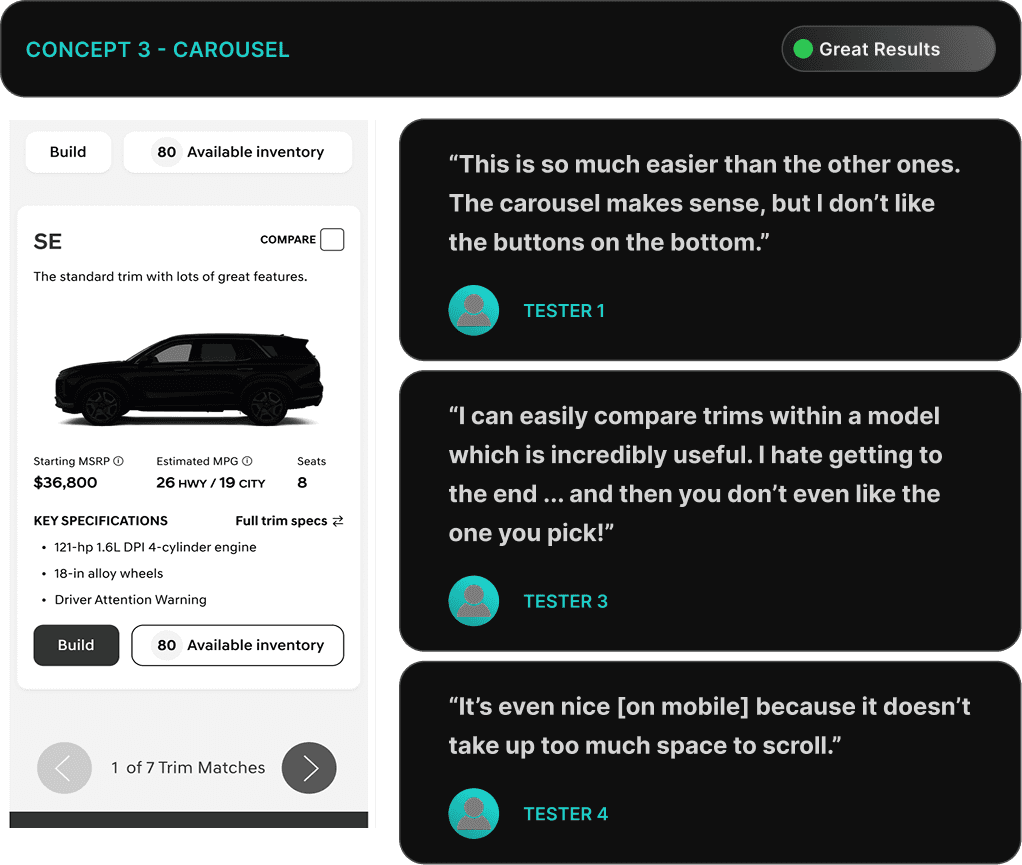
Concept 3: Carousel
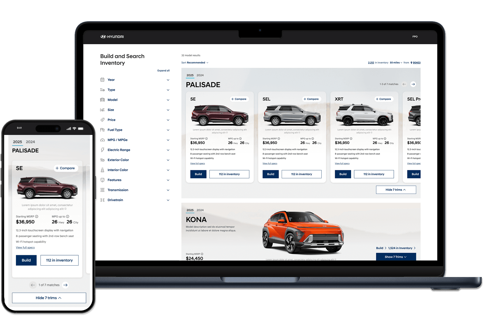
This design features a "Row" layout that transitions into a carousel when viewing trims, allowing for easy side-by-side comparison of key specifications and pricing.
Starting State
On Trim Expand
BENEFITS
Allows for easier trim comparison of a model by having a carousel feature. Users can view cards side by side.
Allows for the compare feature to live easily on the card in the top right.
Keeps all trims visually living under one model.
Mobile keeps trim section contained to small area, which is good for scrolling through multiple models.
DRAWBACKS
Cannot view all of the trims at once if more than 3 trims (on desktop) or more than 1 trim on (mobile).
Lots of tap/click for viewing higher end trims, especially on mobile.
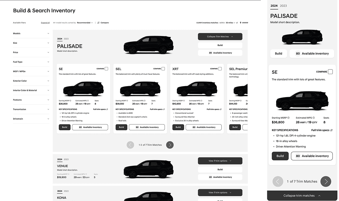
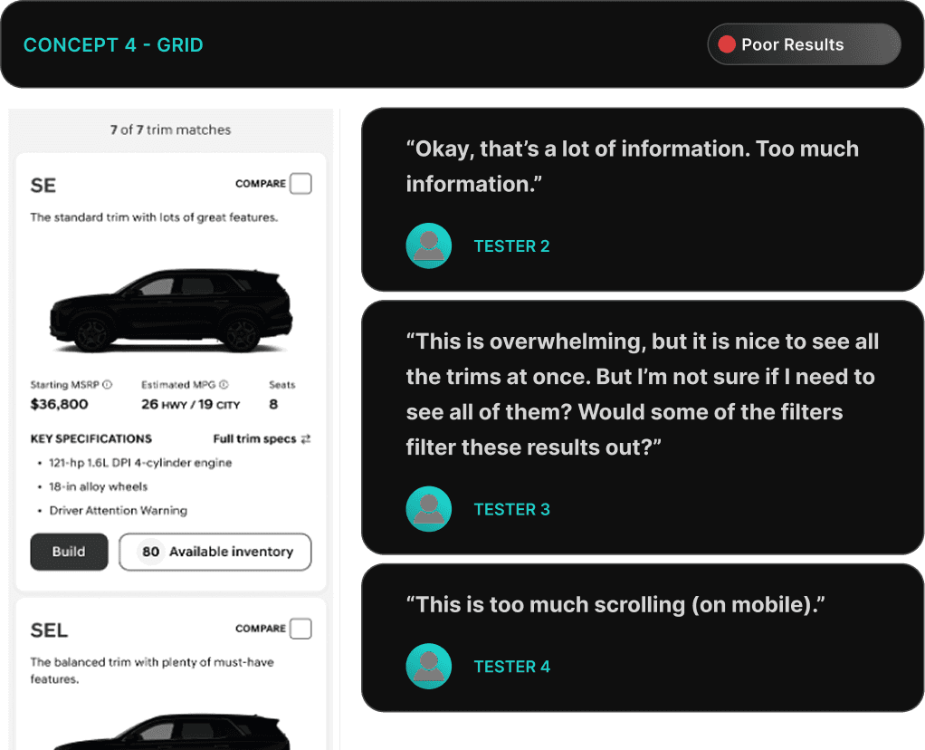
Concept 4: Grid
This design utilizes a "Row" layout that, upon selecting to view trims, expands into a grid displaying all trims simultaneously. Has the ability to view all trims on a single page.
Starting State

On Trim Expand
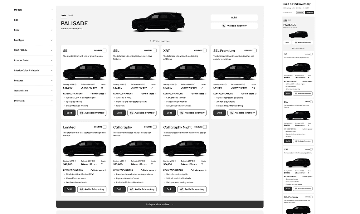
BENEFITS
Allows for viewing all trims at once on one page (for desktop breakpoint)
Allows for the compare feature to live easily on the card in the top right.
DRAWBACKS
Mobile visibility is tough and requires a lot of scrolling.
Information would have to be limited on the cards so that the amount of information would not be overwhelming.
TESTING & Analysis I
Testing low fidelity wireframe prototypes
Testing Questions:
How easily can participants understand the features and differences between the trims in each design?
How easily can participants compare trims in each design? Do they feel able to make an informed choice?
Do participants feel overwhelmed by the amount of information presented in any of the designs? If so, which design causes the most difficulty?
How engaged are participants while interacting with each design? Do they feel frustrated or find the design intuitive?
Which design do participants prefer for selecting and comparing vehicle trims, and why?
What are the limitations of each design.
TESTING & Analysis II
Testing high fidelity wireframe prototypes
Functionality questions:
As a user, I find it helpful to be able to see the trims of more than one model at a time.
As a user, I prefer the ability to click compare on every trim card.
As a user, I prefer the ability to activate a compare state to compare trim cards.
As a user I understand if I click on the CTAs I know what I can expect next. (Build, View full specs, Compare , Available Inventory)
As a user how do I feel about “View full specs” and “Compare trims” taking me to the same place?
Concept 1: Expand

RESULTS
Testers like the amount of information found within the expand layout with an additional 2 specs.
However they did not like how much clicking they had to do to see information.
Concept 2: Flip

RESULTS
Testers did not like the amount of effort needed to understand and compare trims using focused trim views of the flip and grid saying they would need to click on each trim to understand.
However they did like the side by side model comparison ability.
Concept 3: Carousel

RESULTS
75% of testers preferred the Carousel layout overall for the ease in the ability to compare using a side-by-side layout with the availability of key specs.
It was the overall favorite for both desktop and mobile
Concept 4: Grid

RESULTS
Testers did not like the increased need for scrolling, especially on mobile to view the various trims.
However they could view all the trims at once, which was a positive, and not possible with the other versions.
VIsual Design
RESULTS
Top 3!
Overall, the improvements to the site helped the UX, however the visual design and speed of the site declined according to JD Power results.