Dr. Squatch Nav
Implementing best practices for navigation
Client
Dr. Squatch
Role
Lead Product Designer
Industries
Men's Hygiene Products
Year
2024
THE PROBLEM
Marie Kondo the nav
With the launch of a new category of products the Dr. Squatch nav had been officially outgrown. This also required revamping the site architecture and what categories all the products lived under.
There was also a lack of consumer focused considerations as well as a lack of ADA compliance especially on mobile, that was my intention to update.
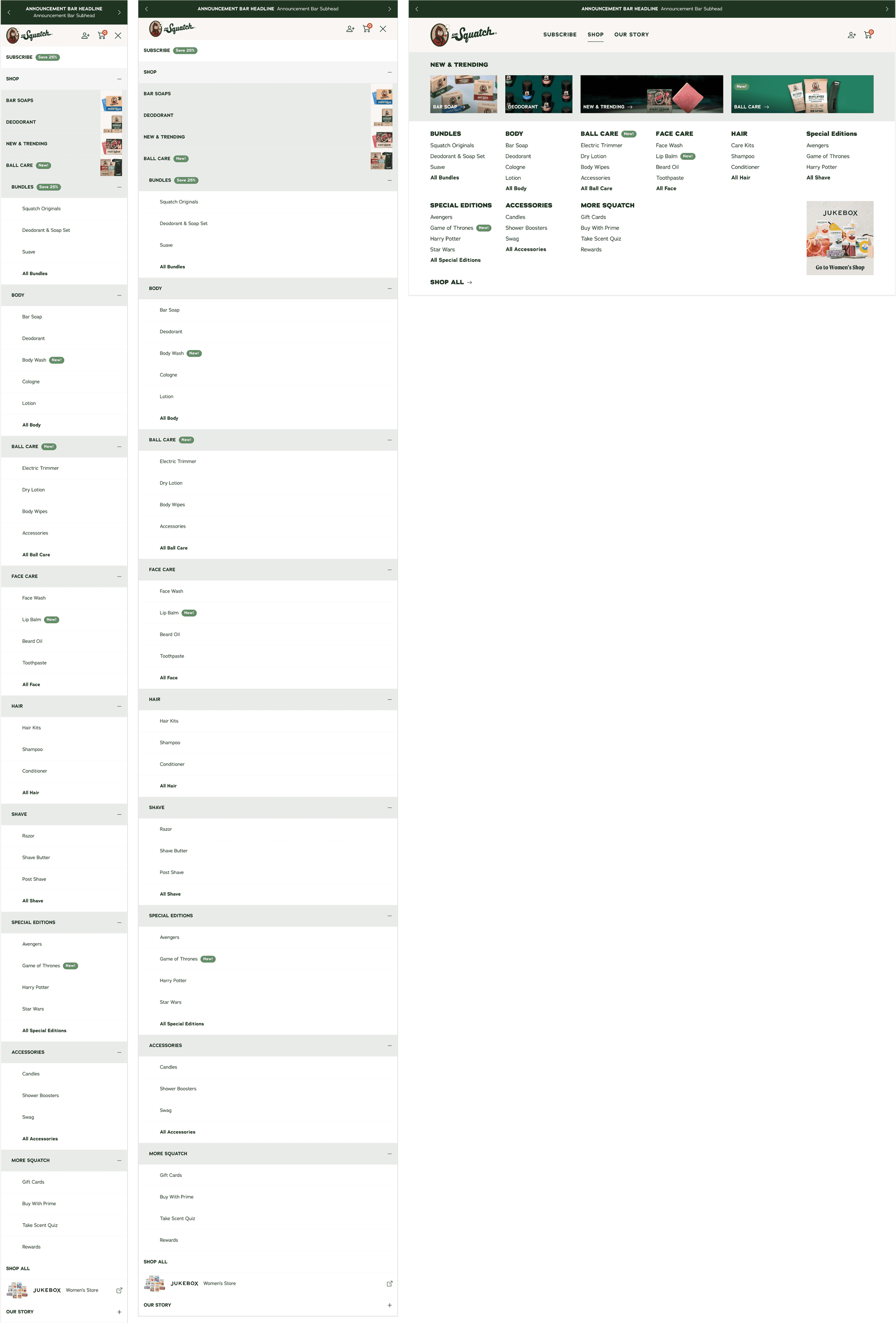
PREVIOUS DESKTOP
PREVIOUS Mobile
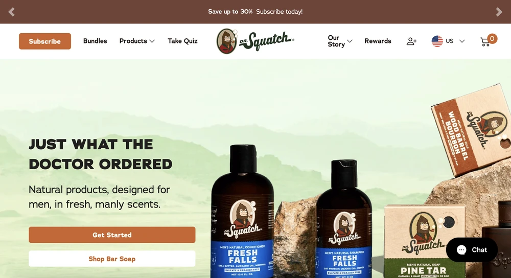
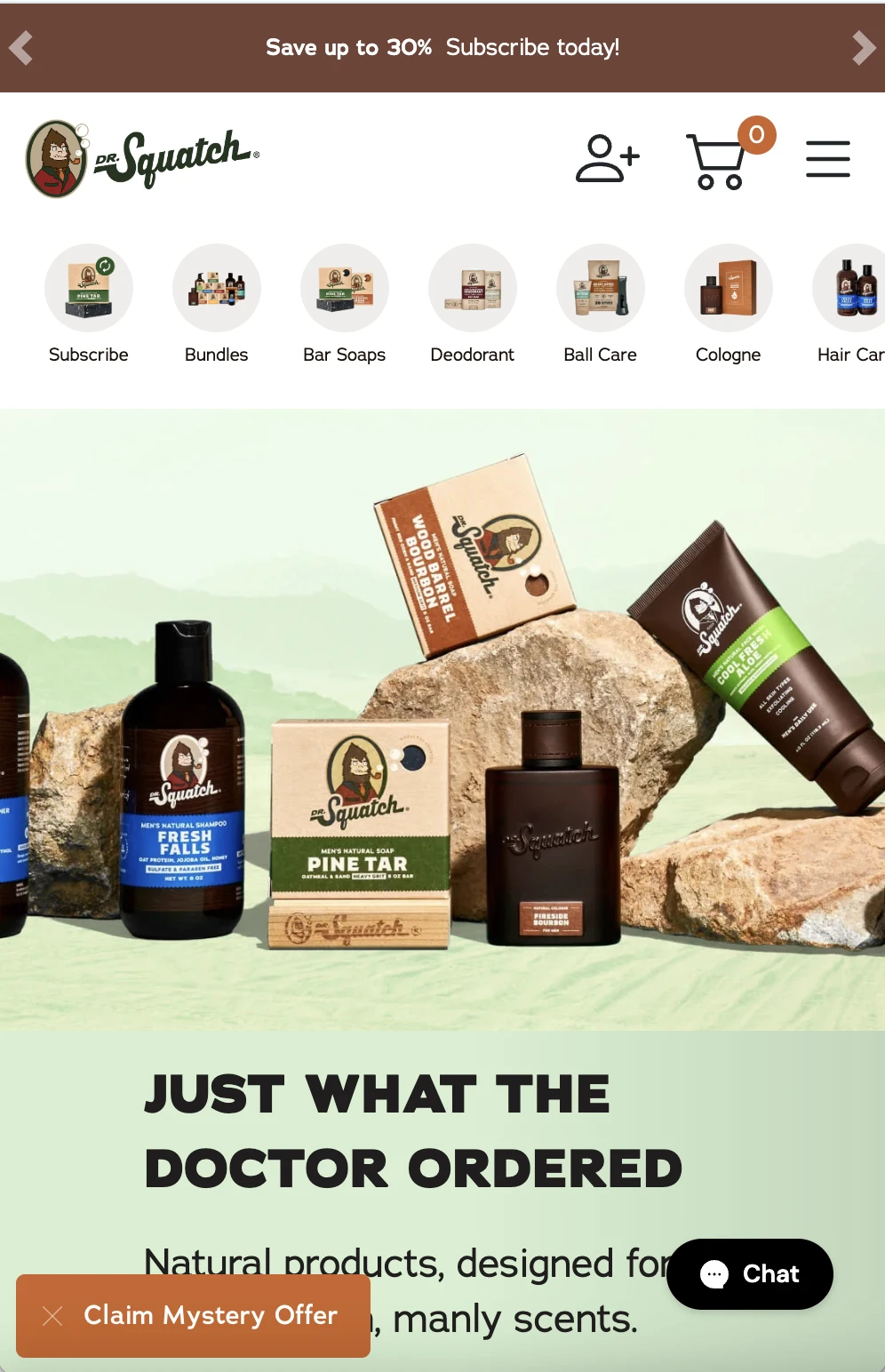
PREVIOUS DESKTOP - SUB NAVIGATION
PREVIOUS Mobile - QUICK NAV


Goal 1
Goal 2
Goal 3
Build for the future
Implement best practices and ADA compliance
Elevate branding & have space for marketing needs
Create a navigation that would allow for easy product and category expansion (CMS)
Organize products by categories that are consumer focused, not launch focused
Mobile was failing in many ways with ADA compliance and needed a total overhaul -> Mobile Quick Nav
Cut down on number of links in the main nav
Update to have more of an elevated feel
Include space that marketing could use for upcoming marketing initiatives
DISCOVERY & RESEARCH
Customer Research
Consumers felt overwhelmed by the main navigation on the site
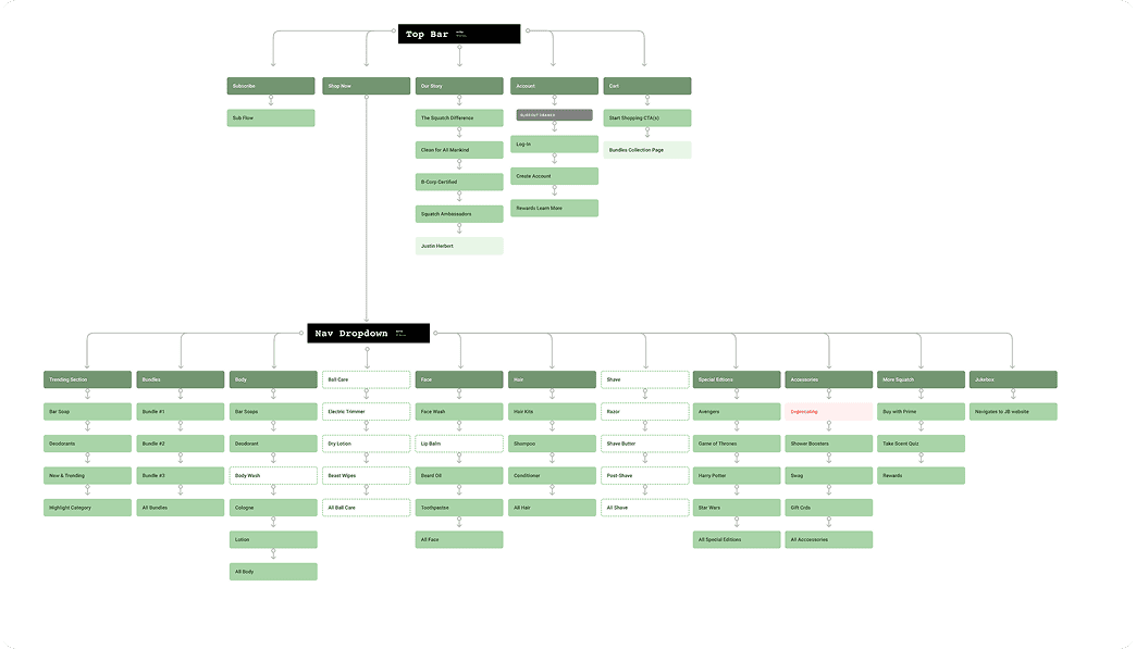
9 clickable links on desktop main nav on desktop
Navigation for Dr. Squatch was designed by marketing initiatives vs. a product team, creating a bloated and confusing navigation.
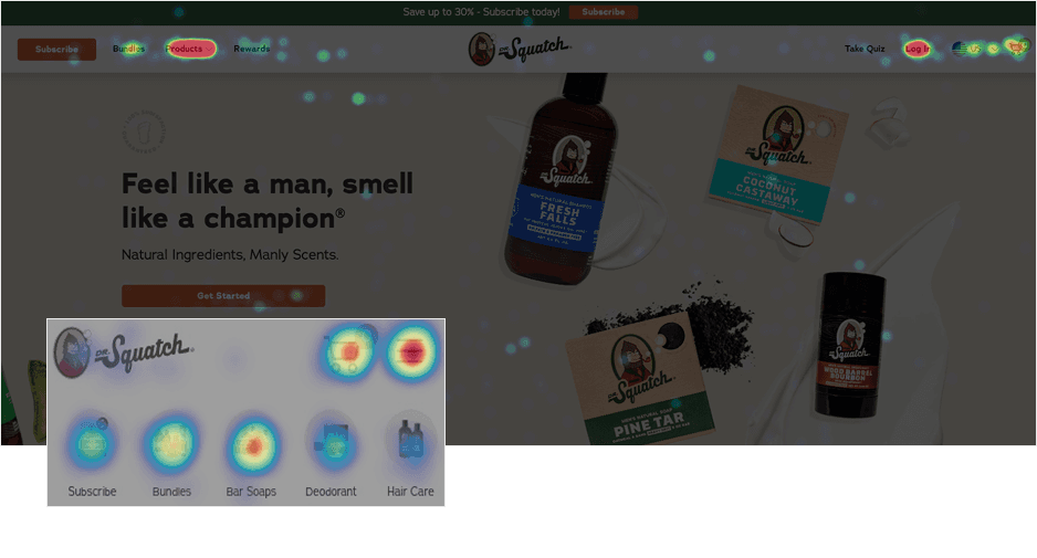
Heap/Hotjar data:
60% of mobile nav clicks go to the quick nav and 24% go to the hamburger menu/sub-nav.
The quick nav cannibilized the hamburger menu/sub nav clicks
38% of unique desktop nav clicks go to the Products link
Bar soap and deo were the top two products on heatmap
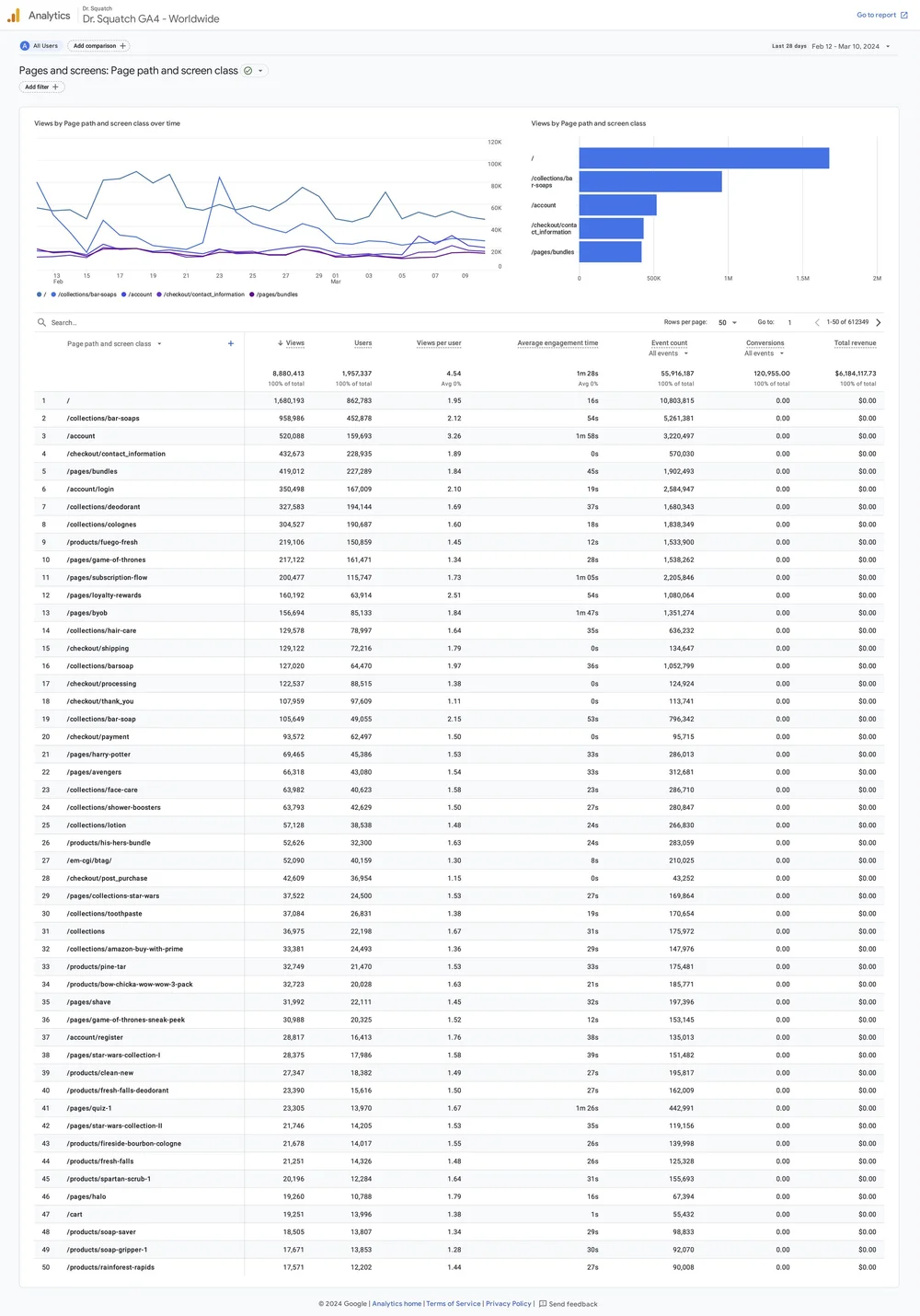
Google Analytics:
The most popular product pages were: Soap, Deo, and Bundles
Customer Insights
Too Many Options
The previous main nav had over 9 clickable areas, two with sub navs. Some, including an (outdated) quiz, bounced the user from the site.
Lack of Organization
Consumers were unsure what products lived under what categories (especially on desktop). Overall insight was to redesign the navigation to make it more visual and improve the hierarchy and visibility of secondary products (Candles, Cologne, Beard Oil, etc.).
Mobile Legibility
The mobile text was hard to read at 10px, far below the 15px ADA compliance requirement.
Mobile images were also so small that it was hard for users to know what was in the picture.
Note: So while it was often used, consumers were often frustrated by the mobile quick nav
Lack of Branding
Unlike the sister brand Jukebox, there was a lack of branding in the navigation, it was a white background and black text. This did not make the site feel “premium” which caused consumers to feel that prices were too high.
USER JOURNEY
Consumer Journey
By organizing the information and keeping the main nav (top bar) more simplified, it helps consumers choose their journey, making product decisions easier.
The desktop and mobile breakpoints were also the same organization adding a cohesiveness to the site that helped with also making it CMS
CURRENT USER JOURNEY
The main nav was very bloated, with far too many clickable areas. The product section is also unorganized with many products as their own “parent” nav.
UPDATED USER JOURNEY
The new flow cleans up the main nav, while implementing a new organizational system for all the category and products that is less confusing to consumers.
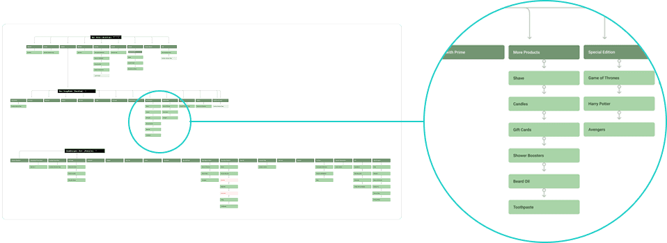
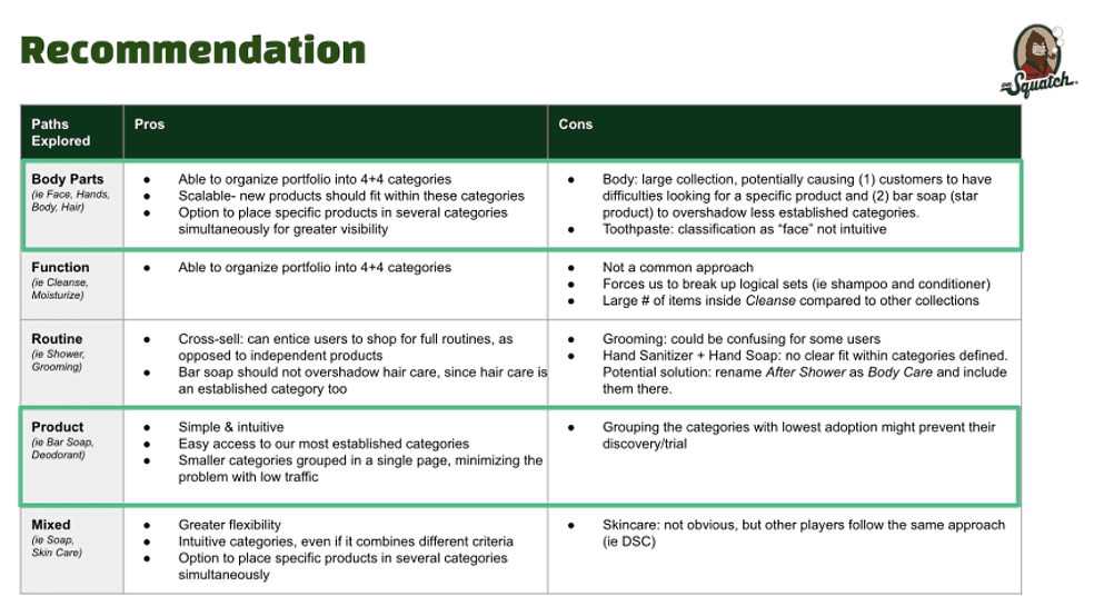
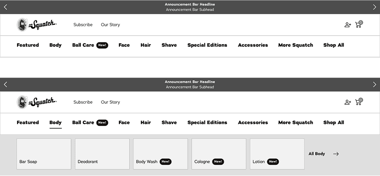
Product categories organization
Products were also re-organized into a hybrid of body parts/product categorization
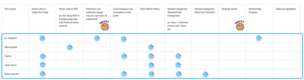
Competitor research and analysis alongside Product and CX teams recommend a mixed categorization/discovery path.
*Updates to the site are fully product focused
TESTING I
Desktop Menu Display
OPEN MENU [DESKTOP]
Open menu has all the categories open on land. It allows a user to view all the categories before clicking into the menu. Once a category is selected the menu opens with all the child categories with images. Example shown: Body
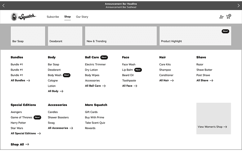
CLOSED MENU [DESKTOP]
Consumers are not able to view categories until the shop all is selected. However the benefit is that all of the categories and child categories are shown at once.
TESTING II
Mobile Menu Display
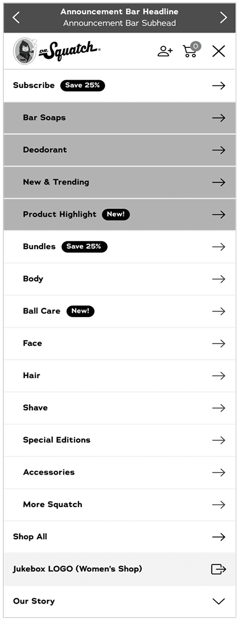
Parent Categories Only [MOBILE]
A simplified mobile menu, that focuses more on directing users to the product landing pages of the category.
Users liked the simplification of the menu, however they would sometimes not find the product they were looking for under that category
The lack of a search bar on the Dr. Squatch site made this option difficult
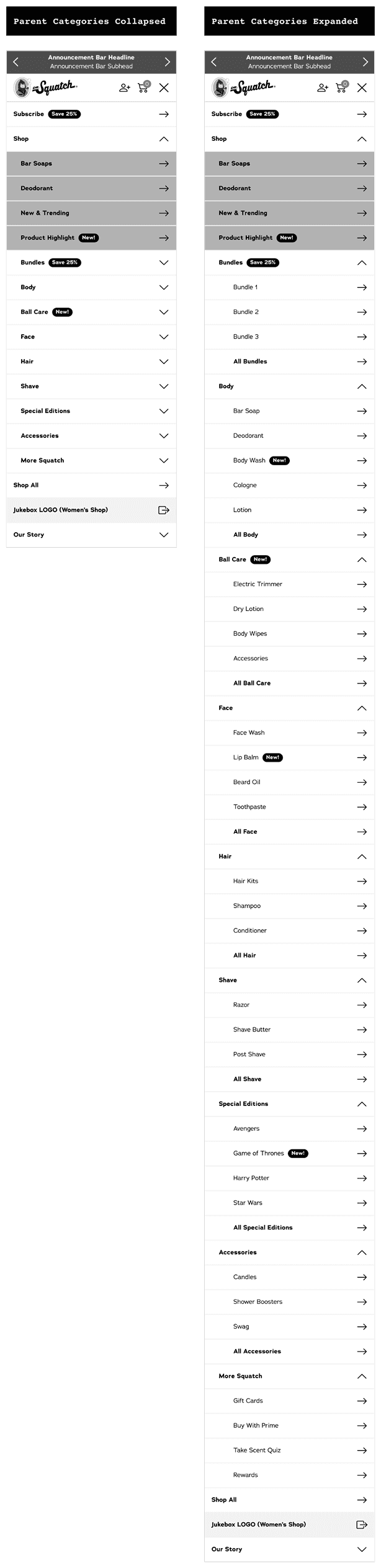
Both Parent & Child Categories [MOBILE]
Both the parent and child categories are present, with only the parent categories open when the menu is tapped on. This option allows views to see all the available child categories, helping them narrow down their choices.
Users found this version overwhelming, but felt they could find all the products
Helped with browsing
Due to marketing initiatives this was the chosen direction
VISUAL DESIGN
High fidelity mocks
Designed multiple breakpoints.
NOTE - DESIGN SYSTEM
Before designing high-fidelity mocks, I had to do some branding work to keep the design clean & high end (these soaps are expensive!)
Previously the site had over 7 greens on the homepage alone, and the creation of the nav required translating some of the print/packaging branding to the web.
This resulted in a whole overhaul of the Design Library and website branding, which I also handled.
Live Site
Live Design
Designed multiple breakpoints.
DESKTOP
Mobile


RESULTS
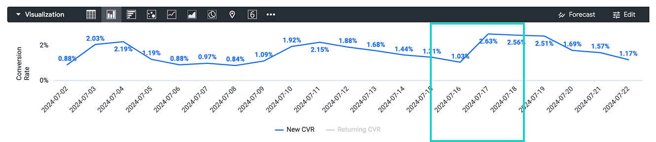
New Customers CVR
The CVR jumped 7/17 the day the launch, from a 1.03% to a 2.63% showing a strong start to the new navigation. It also remained above the minimum 1% CVR.
Returning Customers CVR
While our returning CVR did jump up to 7.16% the day of launch 7/17 from the previous day of 3.65%, it did not make a huge difference in terms of the general average.
